I need to come up with a design which will appeal to the target audience of employers, teachers and potentially students as well, I think that coming up with a design that will appeal to both these groups will be tricky and challenging because there is quite an age gap and variety of people that won't like all the same things or find the same thing appealing to look at.
The first thing that I did was make a brainstorm, this helped me to see clearly the colours that he wanted, the logos, the keywords he wanted, the target audience and content.
Target Audience:
- Students of all ages, who wish to learn about recycling and business
- Employers who want to recruit people with proof of practical skills
Content:
- Sections on; Testimonials, Press Releases, Examples of Redesigned items and Press Reports on Entrepreneurship
Theme/ Colour Scheme:
- Rainbow
Slogan/ Tagline:
- "Success breeds success when values sustain value"
Keywords:
- Employability, action learning, recycling, resource management, creativity, innovation and entrepreneurship
--------------------------------------------------------
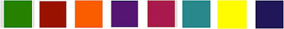
Colour

We asked Clive what colour scheme he wanted and he said 'Rainbow'. When I first read this I was a bit unsure of the scheme and I didn't think that it would work that well, however I thought that I would look more into the colours and try and make sure that I get the best out of them.
What I did to begin with was initially found the colours of the rainbow, which you can see above. From here I decided to take each individual colour and find different shades of each one, I thought that doing this would be effective way into seeing what colours actually worked and also what colours could bring out the best in my design.

Above are all the colours from the image at the top, but there is also the different shades. For me, I was able to see all the colours clearly and could visually see what colours worked and what didn't. I personally felt that the darker colours looked better than the lighter colours, I thought this based on the target audience and the types of people who I am aiming the website at.
After looking at the colours, I narrowed it down to these eight colours. I am not sure whether I will stick to these but I will experiment and see how I can incorporate into my design.
Image
Trying to think of imagery to include in my design was a struggle. As there wasn't other websites that are similar to this type of project it was hard to find examples and also inspiration based on other peoples design. Because of this I decided to go for a different approach, I had a look back at the keywords he suggested and two stood out more than the others, 'Creativity' and 'Recycling'. I decided to write down some words relating to these words to help me come up with some ideas. These are some of the ideas that I thought of for imagery that I could use:
- Background - Texture - Corkboard - Place where people stick ideas - Like a mood board
- Ripped paper - Pieces of paper - Could link to the idea of recycling and reusing
- Drawing pins - Stick bits of paper to cork board
- Masking tape - Sticks bits of paper
The idea of having an image of a cork board in the background and having the content stuck on with drawing was the first thing that I thought of. I struggled to come up with ideas for imagery, but I instantly thought of this idea which I think relates nicely to the idea of creativity and designing. The mock that I come up with will have this theme and I'll see in the pitch what opinions people have on the idea and see if there is a chance where I could develop the idea further.
Layout
I want the layout of the website to be pretty basic and not over complicated.


These are two layouts for the home page that I am thinking of using. I prefer the first layout though and I think that it would be a useful layout for the rest of the pages as well. The second layout I think looks messier compared to the top one, it looks as though the content would be squashed by having the navigation down the side and I think having the navigation a long the top would mean there is more space for the main content.
Mock up
Based on what I have just done, I can now come up with my design mock up which will be ready to show in my pitch.

Above is a screen shot of some of the images that I have included in my mock design, which I made in Photoshop.

I thought of having an image of a t-shirt on the page, for me it linked quite nicely to the name of the project which involves clothing. I also decided to put an image of a recycling symbol on the front of it, I thought this would link it with the idea of recycled clothing. I used the two images on the left to come up with the image on
the right.

The image above is how I want the heading to look. The second image is how I want the navigation to look and the third image is how I want the content box to look. I made a white box and roughly erased around the edges. To make the drawing pins all I did was make a circle and then embossed it, I used the colours the I picked for my colour scheme, which makes them stand out.


No comments:
Post a Comment