Tuesday 20 March 2012

Pitch

After receiving the answers to the questions that we sent Clive, I then moved on to make the pitch, which I presented on the 19th March. I used the answers to help me come up with suitable ideas, however due to not having very much time I found it a struggle to come up with some ideas.

To begin with I firstly made a brainstorm, this told me the things that were required in the website and I also included the target audience. The screen shot below shows my brainstorm.


In my brainstorm I included the keywords which need to be featured, the logos which he has given us, the theme/colour scheme, the content which is the main headings for the pages, the target audience and lastly the tag line/slogan.

Colour
I then moved on to have a look at colour. We asked Clive what he wanted the colour scheme and he answered 'Rainbow', which is a fairly broad scheme as there is quite a lot of colours that could be used. The first steps that I took were finding all the colours, which were red, orange, yellow, green, blue, purple, pink and light blue. I then thought that it would be beneficial for me to find different shades of each colour, this would then give me choice of colours and would help with experimenting. The screen shot below shows all the colours that I found.


The screen shot above shows the first step that I took in order to decide on the colours that I wanted to use. I didn't think just finding these colours and using them would be helpful or would work, so I decided to expand on this and find different shades of each I thought that this would give me more options and would help when I come to experiment and decide.


The screen shot above shows all the colours that I found and their different shades. I found this really useful as I could clearly see all the colours and could see which one would work together and which ones wouldn't. I found all of these colours at www.colorpicker.com, which I found to be a really useful site as there was a wide choice of colours to choose from.
At this stage I then moved on to decide on the colours that I wanted to use. I decided to go with this colour scheme, which you can see below, I chose these because I thought they fitted in with the required colour scheme and they also went well alongside the colour that were already in the logos. These colours aren't particularly bright, however I thought that they would still stand out on a page just as effectively as if they were a brighter shade.


The screen shot above shows the colours that I picked out from the selection that I came up with before. I think these colours work well, fits in with the requirements and at the same time would look good and be appealing to the target audience.

Font
Once I had chosen colour, I then moved on to have a look at font choices. I had a look at a few and decided that 'Helvetica' would be the most appropriate as it is clear and easy to read. I haven't yet decided what font to use for the heading but I will be experimenting and see which one Clive prefers.


This screen shot shows the fonts that I had a look at before deciding on Helvetica. I found these on http://www.w3.org/Style/Examples/007/fonts.en.html 

Slogan/ Tagline and Logos
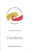
I didn't need to come up with a slogan or a logo design as Clive had provided them already. Below are the logos and the tagline that needs to be included in the website. 


'Success breeds success when values sustain value.'

Mock Ups
I found coming up with an idea suitable for the project quite a challenge, especially as there wasn't any other websites that were similar to this type of project. As I didn't have much time to thoroughly plan and come up with an idea, I came up with a rough mock up in Photoshop. I still need to develop this idea a lot further, however I wanted something to show Clive which would then help me with feedback.

Home Page

Gallery Page

The feedback that I received after I presented my pitch was really positive and was also helpful for me in order to improve on my designs. One of the main points that was mentioned was the use of the ripped paper, looking back I can see that I did over use it and I'm not sure that it worked as well as I thought it might. Another thing was having the logo at the bottom right hand corner of the page, as it is the one place on the page where it would be missed it wasn't a great idea having the logos located there. To improve I will need to change the position of the logo ideally to the top left hand corner of the page.

SEO and Usability

SEO - Search Engine Optimisation


"Search engine optimization (SEO) is the process of improving the visibility of a website or a web page insearch engines' "natural," or un-paid ("organic" or "algorithmic"), search results. In general, the earlier (or higher ranked on the search results page), and more frequently a site appears in the search results list, the more visitors it will receive from the search engine's users. SEO may target different kinds of search, including image search, local search, video search,academic search, news search and industry-specificvertical search engines."


http://en.wikipedia.org/wiki/Search_engine_optimization


"Search Engine Optimisation : SEO is about ensuring that a website is structured and has content that will be found and ranked highly by the web search engines, such as Google, Yahoo and Bing. It is a technique that covers the tye and amount of content on a site, how easy it is to navigate, how well indexed images, etc are."


http://www.tesan.co.uk/jargon.php


SEO stands for Search Engine Optimisation and is the way of getting a website or a web page seen in search engines. SEO makes sure that a website has the right content that will be high up when searched for on a search engine.


Usability


When I come to make my website, I need to make sure the design and content is suitable to the project and will ensure a good user experience. The overall design needs to make sure that it is easy to use, has a good design and will appeal to the intended target audience. The break down of the design consists of content, font, imagery, layout, navigation, colour and SEO.
To guarantee the content for the website is right and suitable for each page, I will be asking him what he wants for the pages, which means most if not all of the content will be supplied by him and all I need to do is include on the right pages. If I get sent a lot of content which would then result in the pages being too text heavy, there would be a chance where I would select certain bit to include or summarise some of the points that are being made. Again the same would apply for images, I would ask my client for the images he would like to be included and what sorts of things I need to search for in order to retrieve the right imagery for his project. 
After establishing the content for the website, I then need to move on to think about the types of font that it will be displayed in. I need to make sure that it looks clean, professional and easy to read and at the same time try and have it look creative and appealing to look at. I would consider having a simple font for the main body text, this would make it clearer and easier for people reading. On the other hand I would consider having a little more styling to the headings and title, this would help to break down the content and make it look that more visually appealing. Lastly I would stick to two fonts for the whole website, one for the body text and one for headings.
The layout for my website is going to be one of the key things that is going to appeal to people. I don't want to over complicate the layout and I think having a simple one will be just as effective. The layout will be broken down into four sections; the title, the navigation, the main content and the footer. I don't want to clutter the page up and make it daunting to look at, so I need to carefully think about how the content should be laid out on the page. I need to ask questions such as; do I need to make the text bigger? Should some of the images be on an angle? Would it look ok if the content was on the left hand side and the imagery on the right?
The colour is another key thing that would ensure the website appeals to people. I will be finding out from my client as what colours/ colour scheme he has in mind for this website.
Finally making sure the navigation is simple will help ensure a positive user experience. I need to make sure that my navigation is clearly labelled and easy to follow.

Mock Up

Now that I have received the answers to the questions and have been given some content, I can now start to think about designing a mock up of how I think the website should look based on the design answers Clive gave. 
I need to come up with a design which will appeal to the target audience of employers, teachers and potentially students as well, I think that coming up with a design that will appeal to both these groups will be tricky and challenging because there is quite an age gap and variety of people that won't like all the same things or find the same thing appealing to look at. 

The first thing that I did was make a brainstorm, this helped me to see clearly the colours that he wanted, the logos, the keywords he wanted, the target audience and content.

Target Audience:
     - Students of all ages, who wish to learn about recycling and business
     - Employers who want to recruit people with proof of practical skills

Content:
     - Sections on; Testimonials, Press Releases, Examples of Redesigned items and Press Reports on Entrepreneurship


Theme/ Colour Scheme:
     - Rainbow


Slogan/ Tagline:
     - "Success breeds success when values sustain value"


Keywords:
     - Employability, action learning, recycling, resource management, creativity, innovation and entrepreneurship


--------------------------------------------------------

Colour


We asked Clive what colour scheme he wanted and he said 'Rainbow'. When I first read this I was a bit unsure of the scheme and I didn't think that it would work that well, however I thought that I would look more into the colours and try and make sure that I get the best out of them. 
What I did to begin with was initially found the colours of the rainbow, which you can see above. From here I decided to take each individual colour and find different shades of each one, I thought that doing this would be effective way into seeing what colours actually worked and also what colours could bring out the best in my design.


Above are all the colours from the image at the top, but there is also the different shades. For me, I was able to see all the colours clearly and could visually see what colours worked and what didn't. I personally felt that the darker colours looked better than the lighter colours, I thought this based on the target audience and the types of people who I am aiming the website at.


After looking at the colours, I narrowed it down to these eight colours. I am not sure whether I will stick to these but I will experiment and see how I can incorporate into my design.


Image

Trying to think of imagery to include in my design was a struggle. As there wasn't other websites that are similar to this type of project it was hard to find examples and also inspiration based on other peoples design. Because of this I decided to go for a different approach, I had a look back at the keywords he suggested and two stood out more than the others, 'Creativity' and 'Recycling'. I decided to write down some words relating to these words to help me come up with some ideas. These are some of the ideas that I thought of for imagery that I could use:

- Background - Texture - Corkboard - Place where people stick ideas - Like a mood board
- Ripped paper - Pieces of paper - Could link to the idea of recycling and reusing 
- Drawing pins - Stick bits of paper to cork board
- Masking tape - Sticks bits of paper

The idea of having an image of a cork board in the background and having the content stuck on with drawing was the first thing that I thought of. I struggled to come up with ideas for imagery, but I instantly thought of this idea which I think relates nicely to the idea of creativity and designing. The mock that I come up with will have this theme and I'll see in the pitch what opinions people have on the idea and see if there is a chance where I could develop the idea further.

Layout

I want the layout of the website to be pretty basic and not over complicated.


These are two layouts for the home page that I am thinking of using. I prefer the first layout though and I think that it would be a useful layout for the rest of the pages as well. The second layout I think looks messier compared to the top one, it looks as though the content would be squashed by having the navigation down the side and I think having the navigation a long the top would mean there is more space for the main content.


Mock up

Based on what I have just done, I can now come up with my design mock up which will be ready to show in my pitch.


Above is a screen shot of some of the images that I have included in my mock design, which I made in Photoshop. 


I thought of having an image of a t-shirt on the page, for me it linked quite nicely to the name of the project which involves clothing. I also decided to put an image of a recycling symbol on the front of it, I thought this would link it with the idea of recycled clothing. I used the two images on the left to come up with the image on
the right.


The image above is how I want the heading to look. The second image is how I want the navigation to look and the third image is how I want the content box to look. I made a white box and roughly erased around the edges. To make the drawing pins all I did was make a circle and then embossed it, I used the colours the I picked for my colour scheme, which makes them stand out. 


Content

After receiving the email of answers to the questions we asked, our client Clive then sent an email which contained some content and images, this was useful in order to coming up with design mock ups ready to show him during the pitch.


The screen shots above shows the content that was sent.


Thursday 15 March 2012

Questions and Answers

On Monday we were supposed to have a meeting with our clients, this was an opportunity to ask questions that would help us to find out more about them and what they require for the website. Unfortunately none of the three clients were able to come in and talk to us, so instead we split up in our groups and emailed our set of questions to the clients. After a couple of days we got a response and here are the questions and answers that Clive Bonny sent back:

-----------------------------------------
1. Could you elaborate on what do you do as an organisation? 
Work collaboratively with other specialists to develop organizations and individuals.
Our main aims are to ensure business continuity, facilitate risk management and maximize the potential of people’s capabilities.

2. Is this a training scheme for managing a project and in how to create products from recycled material? 

Yes the project is called Self Made Creative Clothing. The aim is to boost a persons employability. The project encourages students of all ages to acquire used clothes and textiles to redesign, reuse and recycle into other items of their choosing.

3. What are the project aims? 
The short term aim is to engage students in practical activities around recycling and the management of materials and resources. This improves skills in teamworking, design, innovation and planning. Medium term participants develop practical skills around the cycle of business, designing usable items from low cost accessible resources. They can show their tangible results, including photos and videos to potential employers to win future work.

4. Who is your target audience?
Students of all ages who wish to learn about recycling and business, and employers who want to recruit people with proof of practical skills.

5. What is the project background and history? 
The Royal Society of Arts www.thersa.org awarded me £2000 last year to test the concept. This grant was used to buy used clothes allowing 500 local students in 3 schools to have a go. Feedback was positive with students reselling items locally.

6. What activities do you run in order to enhance the person/s skills? 
I let them choose their own raw materials and designs to give them responsibility and a greater sense of achievement

7. How long has the project been running? Do you have any previous success stories, testimonies available? 
This project which began in February is a follow up from the first last year which ran March to July. Testimonials:

Sophie Gaston, school head of Entrepreneurship at Brighton Aldridge Community Academy, is planning more events to bring successful business people back to school to mix with the new generation of students. Sophie says “Organisations want young people who can show real evidence of enterprise skills. Practical skills in recycling waste are already in great demand by private and public organisations. These activities will equip students with more rounded confidence and competence to meet employer needs.”

Darren Fell MD of Crunch commented: “Crunch is very proud to support schemes that help build business skills for the next working generation. With youth unemployment recently breaking the one million mark, it’s vital that employers share their knowledge and experience with local young people. This group of highly ambitious students will now have the skills to continue to manage their business and the knowledge on how to set up a new enterprise in the future.” Crunch is founded by online entrepreneur Darren Fell, with investment from Bebo’s co-founder Paul Birch and former Skype Chairman Michael van Swaaij.

Duncan Cheatle, Founder of The Prelude Group, Start Up Britain and Rise To The Enterprise Challenge, says “we support such innovative projects to make Britain the most enterprising nation in the world”

£800 obtained 1.5 tonnes of used clothes for Brighton Fashion Week’s 10 textile design graduates. 200 hours made a world record 1.5 tonne PomPom to Jubilee Square publicly promoting recycled clothing. Published stories ran in the Argus, So Brighton Magazine, Brighton Town Talk, Festival News, Fringe and Brighton Fashion websites, Business Community Partnership, Going Green magazine, Radio Reverb, U-Tube and others. Reader circulation was over 250,000 plus 60,000 radio listeners plus thousands of U-Tubers on

http://www.eventfulbrighton.org/2011/05/14/the-worlds-biggest-pompom-brighton-fashion-week-brighton-festival-fringe-2011/

£400 each went to 3 schools. Shoreham Academy said “ 27 pupils attended Fashion Club over the term. We have made a mood board, fashion drawings, make up bags, a box of garments made from recycled fashion. All of year 7(258 pupils) & 8 (227 pupils) made recycled zipper cases. Year 7 made recycled toys and Year 8 made recycled storage for their bedroom.”

“20 children at Rydon and we would like to double this next year… to hold a fashion show. All the students are very enthusiastic and very interested in fashion.”

Rustington Primary children’s Recycled Exhibition raised £235 funding a Wildlife area.

Clive,
This is just fantastic! I'm in the midst of a large-scale redesign on my end, but this kind of work is precisely what could be contained in our to-be-announced Entrepreneurship Certificate program. I am an fRSA in the USA. I'm very interested in connecting with you regarding your project to help students nurture their entrepreneurial side. I work in an independent school (students aged 3 years to 18 years), and am heading a new division which is entirely on-line, but whose raison d'etre is "connect, communicate, collaborate." You can see the website at www.towerhill-eschool.com.

We have not yet had our public launch phase; that is due to come in September. However, at this stage, I am looking to form unique partnerships that will benefit students all across the world. One of the courses I have in mind is something on Entrepreneurship. In short, I am wondering if you and I might connect in order to construct a course that would be contained within our eSchool, accessible anytime/anywhere. It could be very exciting! Kevin J. Ruth, Ph.D. Director, Tower Hill eSchool

Click here to learn about partnering with us!

Tower Hill eSchool | 2813 W. 17th Street | Wilmington, Delaware 19806
(v) 302.575.0550 x339 | (skype) kevin.j.ruth | (e) kruth@towerhill-eschool.com

Clive

Thanks for this – looks absolutely brilliant – if I was still teaching I would definitely be grabbing this opportunity. Young people need all the opportunities they can get to enhance their skills. The work you are doing on this is great and will provide some real opportunities for those involved. Keep up the good work. Best Wishes

Gill

Gillian Ditch

Education Business Partnership Room 314, 3rd Floor

Kings House Grand Avenue Hove BN3 2LS Tel 01273 290482 ( ** Note: Change in hours: Tuesday & Thursday term time ) Mob 07906 842704 www.bhlp.org.uk/ebp 'Encouraging Brilliant Partnerships'

8. Are there a team of people who run the project? Would you want their skill/role background on the website? Any other participants? 
I let the schools nominate a teacher and the children select themselves into small groups

9. Where do you currently operate? 

Across Sussex and looking for a wider span of stakeholders across UK and outside

10. Where do you accept people from? Locally, further a field etc. 
Anywhere interested in

11. How do you currently promote the business/project? 
Press articles, web blogs and word of mouth

12. Have you received any awards? 
The Catalyst Grant is an Award in itself, competing with many strong applicants

13. Do you know of any other projects similar to this? 

There are many organizations involved in recycling textiles but none which extend activities into action learning to support student employability

14. How do you source your clothes? 
Charity shops, business people, parents and recyclers

15. Do you have any connections to social media, Facebook, twitter etc? 
You tube video promoted us
http://www.youtube.com/watch?v=OY57xpharec

16. Do you want links to journal trade sites on your website? 

Yes to www.thersa.org and www.consult-smp.com and to those who give testimonials

17. Do you have connections to ethical fashion forum? 

Fashonistas broke a world record by creating a giant pompom to raise awareness of recycling. The huge 5ft 5in high creation took volunteers a week to make. Passers-by in Jubilee Square, Brighton, stopped to stare at the pompom, which was 12ft 6in wide and was put together as part of Brighton Fashion Week.

The idea was funded by a grant from the Royal Society for the Encouragement of Arts, Manufacturers and Commerce to promote the creative reuse of fashion and textiles.

The creation smashed the previous Guinness World Record, which measured 4ft high and 10ft 8in wide. The pompom will now be taken to a recycling plant where it will be broken down into natural fibres and spun into a giant ball of yarn which will eventually be used to make socks and the insides of jackets.

18. Do you know the term up-cycled? 
Yes adding value via redesign and reuse


-----------------------------------------
Design questions:

1. What do you want the site to achieve/do? 
The site should attract blogs from existing stakeholders and new schools and businesses to engage

2. Do you have a slogan/tag line? 
Yes
Success breeds success when values sustain value

3. What do you want the site to feature content wise? Anything especially want/do not want on the home page, other pages? 

Features to include testimonials, press releases, examples of redesigned items, press reports on entrepreneurship and action learning methods

4. If your site was a person what personality would it have? 

Leonardo Da Vinci as he epitomises the creative sciences

5. What content do you have available for use? Images, video, documents etc. 
Lots of content re PR, action learning methods and industry reports of needs

6. How will people using the site get in contact? Do you have an email, address, phone number that you want to have on the site? 
Yes my details as below

7. What words/phrases would you want to be able to search online for your site to come up? Which are more/less important? 
Employability, action learning, recycling, resource management, creativity, innovation, entrepreneurship

8. Have you got a theme/colour scheme in mind? 
Rainbow

9. Do you want to be able to have people sign up for email based newsletters? 

No I want onsite blogs/reports and photos from participants

10. Do you have a current logo (do you want a logo?), are you happy with it? Do you any other existing documents? Leaflets, business cards etc, that you would like the design to follow? 
Yes my logo and RSA logo 


11. Have you seen any websites you like the look of? 
No


-----------------------------------------
Others:

1. Do you need to be able to update the website? If so how regularly? 

Update monthly

2. Will you be advertising any partners/businesses involved in the project? 
Participating Schools and businesses can add their details

Sunday 11 March 2012

Research: Clive Bonny


I found this profile on Clive Bonny on http://uk.linkedin.com/pub/clive-bonny/6/4a1/264


I have found another profile about him and I got this from http://www.clivebonny.com/

This is another page that I found, which explains what Clive Bonny does. The page is https://www.crunch.co.uk/clive-bonny-strategic-management-partners/

The client that I have been given

This is the client that I have been given:


Client


Clive Bonny

Project:
Self Made Creative Clothing

Description:
Self Made Creative Clothing supports, and acts as a catalyst for, projects helping learners of all ages with creativity, innovation and entrepreneurship using low cost accessible clothing materials and other associated recycled resources.
In the short term, leaners have the opportunity to enhance these skills whilst working towards an environmentally sustainable outcome.
In the medium term, learners have the opportunity to further enhance a range of skills from presenting and project management through to fashion marketing and hand-made manufacturing.
In the long term, the programme will act as a boost for social/sustainable enterprise and help improve employability amongst young people.
The programme will eventually deliver a report recommending tools and processes to enable non- accredited entrepreneurship skills and knowledge (developed during extra-curricula learning activities and projects) to be better demonstrated to employers, thereby enhancing a person’s employability.

Contact details:
01273 308865
Clive@consult-smp.com

Requirements:
A media rich website to showcase project aims, background, participants, activities and outcomes.

Target Audience:
Students, employers and people interested in recycling, sustainability and enterprise.

-----------------------------------------------

From here I now need to do some research into Clive Bonny and what he does so I have a good understanding as to what he is about, ready for meeting him on Monday. Another thing that I need to do is come up with 12 questions that I could ask him which will help me get a better idea as to what he wants from the website and the sort of things that he wants to be included.

Thursday 8 March 2012

Questions

After receiving the three clients, we were then told we'd be meeting them in a weeks time. This meant we needed to come up with relevant questions that would be beneficial in order to understand what they want from the website. These are the questions that we came up with as a class, which cover the three clients:


Why do you want a website?
What do you want to achieve from the website?
Who is the Target Audience?
Have you already got a logo?
What content do you want to feature on the site?
Have you already got a theme/colour scheme?
What do you do?
How are you different from the bigger stores?
Do you want prices up on the site?
What age range are the children?
What activities do you do at the nursery?
Background of the company - how long has it been going for?
How do you want the website to be broken up? eg home, contact us
What are the facilities at the nursery? 

The Three Clients

These are the client briefs were given to us by First Steps.


Client 1:


Client: Clive Arnold
Project: Central Appliances
Description: Central Appliances are a small, local domestic appliance company established for 23 years. They supply and repair domestic appliances in the Brighton and Hove area.
Requirements: A simple design with just 2 or 3 pages. The client doesn't want a complicated site with too much content. This should be balanced with getting the key information and message across.
Target Audience: General Public, Lettings Agents and Landlords.


Client 2:


Client: Clive Bonny
Project: Self Made Creative Clothing
Description: Self Made Creative Clothing supports, and acts as a catalyst for projects helping learners of all ages with creativity, innovation and entrepreneurship using low cost accessible clothing materials and other associated recycled resources.
Requirements: A media rich website to showcase project aims, background, participants, activities and outcomes.
Target Audience: Students, Employers and People interested in recycling, sustainability and enterprise.


Client 3:

Client: Peggy Fenlon
Project: PACES, Nursery
Description: PACES for Brighton provide a high quality care and education for children, primarily below statutory school age. They employ 6 staff and work with volunteers from Brighton City College giving them work experience and training. They aim to continue fund raising to keep costs for the community down.
Requirements: A regularly updated website is a requirement for the funding they receive. They would like to keep parents up to date with current PACES information and provide general advice from the website. Website content should cover:
- Introduction to PACES
- Prices
- What children do whilst in their care
- Staff and Qualifications
- Management Structure
- Healthy Eating
- Keeping Safe
- Money Saving Tips
Target Audience: Mainly single parents, often with limited reading skills. Looking to also attract new parents and families.

Project Five: Developing a Website for a Client

The Brief


For this assignment you will be given a client to produce a web site for.  These clients are working with a company called First Steps, who have negotiated the individual briefs with the clients, so they will be briefing us on the nature of the clients’ requirements on the first day of this project (Monday 5th March).  During the project you will be liaising with the client and with First Steps by a set of agreed deadlines for research, ideas, mock-ups and a prototype.  A record of your correspondence with the client, including any feedback they have given you, must be presented in your blog. 

Three websites have been commissioned so you do not have a client each.  There will be groups of up to 4 students working on each project, but you are working competitively rather than collaboratively. Your tutors will allocate you your group and client. You will each be working individually to answer the brief and produce a website suitable to the client’s needs, though you may need to generate content for the website collaboratively. The client will ultimately choose one site they intend to use professionally (as long as there is one which is suitable to their needs and produced to a high enough standard). 

You will build your web site using html and css in a text editor, such as Textwrangler, and the graphics will be made in a Photoshop and/or Illustrator, then compressed for the web.  You will build and develop skills to provide a sophisticated interactive user experience in this website.  This will mean you can introduce interactive image display features such as remote rollovers and lightboxes, as well as enhancing the interactivity with features such as animated transitions using jQuery and CSS3 techniques.
For the typographic elements of your design you will use webfonts using either @fontface or Google Web Fonts.

You will have to use the First Steps initial briefing on the client and their requirements as the terms of reference for your visual research and the development of your designs.  It is important that you gather a strong set of visual references for the subject area with which you are dealing and that you can make clear and cohesive decisions about the appropriate visual language you use. 

You will need to demonstrate your approach to the creative process using methods that are standard to the digital media industries.  As well as your visual research, your sketchbook and blog should show sketches, ideas and experiments for the designs in development so the processes you used to reach decisions on such issues as wireframe layout, colour, typography and navigation are transparent.  Navigation must be planned using flow diagrams. 

Just as you will have to constrain your design decisions to the expressed wishes of the client, so too will you have to remember that you are making a web site and allow for the limitations of the technology. Your design should pay clear consideration to what you have learned so far about the realities of web design.  For example, you should think about the target audience identified by the client and consider what kind of computer they will have, what kind of internet connection they have, what kind of screen resolution they’re likely to be using and how that will affect the images and the design you make.  Your sketchbook and/or blog must include a section of research into these kinds of issues, including recent statistics on browser type and version use, proportions of different screen resolutions, platform, and internet connection speeds.  You should also comment on why this is useful information to you as a web designer. 

In the pitch you need to show the research process in order to justify how you reached your design decisions. The pitch must include navigation flows, wireframes and full mock-ups based on grids. 
You must produce a ‘Branding Guideline’ for your proposed design. This should include Logo design, typographical choices for headings and body text, colour palette, examples of interface elements, at least 2 page mockups and a sitemap of your navigation. You will also include a price for the project.
This Branding Guideline must be included in your pitch and must also be uploaded to the server as a pdf document and a full colour printed version supplied at the time of the pitch.
You need to show and justify where you are intending to include your enhanced interactivity.  You need to make any changes to the mock-up based on pitch feedback and send .jpgs of them to your client for feedback following the pitch.  Further changes may be necessary following feedback from the client, and on-going liaison with the client may guide your ongoing design development.
(please treat this as if you were competing for a paying job and prepare your presentation accordingly).  

The site you create must be optimized for search engines and accessible to people with disabilities. Your sketchbook and/or blog must also show research into these areas and your site must demonstrate the application of techniques helpful to SEO and accessibility.

Sites will display differently in different browsers, so the testing process is important. You will put your site online on the courses server and test on a range of browsers and platforms at a range of screen resolutions. You will record the testing process in your sketchbook and/or blog.