Overall I have enjoyed this project, however if I was to do it again I would definitely do it all differently. I don't think I went about it the right way especially when it came to the length of time we had for the project. I think because it was so long I kept putting things which wasn't the right thing to do, this mainly happened near the end of the project though.
At the beginning of the project I was pretty organised and managed to come up with an idea fairly quickly and managed to gather quite a bit of images and documents which was really helpful, I blogged at least once a week and was making good progress. I think the down fall for me was after the pitch. I think that I would have benefited from making more deadlines for myself to ensure I finished everything in good time.
One of the main problems that I have had throughout the project is the use of After Effects. As I had never used this software I wasn't at all confident with it and didn't really know what I was doing. I found we didn't have many tutorials with it, and found that I was constantly putting off the idea of using it, which I found wasn't a really good plan. By the end of the project I started to get to grips with, but I think this would have been more useful earlier on in the project. On the other hand I found using iBooks pretty simple and didn't really have a problem with using and I am pleased with the out come of my book.
I also found I used my sketch book a lot more with this project, compared with previous projects where I haven't really filled it. I found it really helpful with this project and it helped with designs and content.
I will definitely take away a lot from this project and apply it to the next project, mainly the use of scheduling.
Wednesday, 12 December 2012
Time Schedule/ Management
Looking back at this project I think that I could have used a time schedule in a more effective way. I think because of the length of this project it would have more useful to me to have set myself deadlines in order for me to keep up to date with the project rather than just aiming for the key dates that were set in the brief, like the pitch, crit and deadline.


Above is a time schedule that I made. The dates in red are the key dates that were put in the brief. Like I said at above, I think that I would have benefited from setting myself more deadlines to ensure that I was up to date through out the project especially as the length of the project was quite long.
Nearer the end of the project I made myself another project schedule which I drew up to help with getting my project finished. Below is a screen shot of it:


Tuesday, 11 December 2012
User Testing
Having had crit and seeing people use my eBook, I now have a better idea as to how I can improve the usability of my book to make some of the content clearer. The crit was a good test of the usability of my book and now I can make the right changes to hopefully improve it.
Since making the changes, I have had some family members try out my book. They found it easy to navigate and go through each page. They knew where about the audio was throughout the book and were able to clearly read the font.
Since making the changes, I have had some family members try out my book. They found it easy to navigate and go through each page. They knew where about the audio was throughout the book and were able to clearly read the font.
Changes
I have now done the changes to my eBook and I am really pleased with the outcome.
One of the first things that I changed was the font size. Originally when I made my book, I had the font size at 16 which didn't seem to be that small, however during crit it was pointed out that it could be a little bigger so I decided to change so that it is now 18. There is noticeable between the two sizes and the 18 is definitely seems to be easier to read.
The next thing that I changed was the 'Bio' page. Originally I had two double page spreads, the first two had some text and the wallpaper and the second some more text and the wallpaper. During crit it was suggested that I change this and have everything on one page. To change this, in iBooks author I added a widget and I selected the scroll box, I copied and pasted my text into the box and resized it and positioned it to where I wanted.

The screen shot above shows what the 'Bio' page now looks like. Where the text is there is now a scroll. I think this change works better than how I first had it as all the text is now together instead of being separated.
I then went on to move all of my pages so that they're all in one chapter instead of having each part in its own chapter. By doing it means the navigation will be easier and the links to each page will work.
This is how I originally had my chapters and how the contents page was set out, which meant the pages didn't link to each other.

This is what it looks like now that I have changed it. I have done it so that everything is in one chapter and now when you click on one of the links it take you to the different sections, whereas before it didn't.

Another comment that I got was that there was quite a big gap between the title and the text so I have now moved the text so that it is just underneath the heading and have also added some more text underneath it.

This is what the page now looks like.
Another point that I received was that I needed to make the fact that there was audio on the page clearer. It was suggested that I could use a gramophone to indicate there was sound. I experimented in Photoshop and came up with this:

and this is what they look like on the pages


During crit it was suggested I have interactive images right from the beginning of the book, instead of a couple of pages in so I changed it so that now when you click on the picture of my Great Grandma a speech bubble comes up with some text.

This is what the page now looks like.
The last thing that I did was finish the animations and added them to the eBook.
Crit
I was hoping that Crit
would be able to help me with where I was up to with my eBook and although I
didn’t have any animations in my book I still received helpful feedback to help
me improve on my book.
These were the points
that I received:
Like the wallpaper and
the images in frames
The audio on the Rationing page
Make the font size bigger
Add a scroll on the Bio page so all the text is on one page
Move all the pages so that they are in one chapter, will be easier for the navigation/ contents page
There is quite a big gap on the ‘Where She Lived’ page
Make it clear that there is audio on the page, make an indication
Bio page – have a pop up info on the photo of my Great Grandma
Could have a gramophone on a table, which can be used for the audio
Use the cross stitch idea to perhaps indicate that there’s interaction
Finish the animations and add them
Now that I have done
my crit, I have a couple of days to make the necessary changes to my eBook. I
am happy now that I know what needs to be improved to my book and I can now get
on with the changes ready for deadline.
eBook - before crit
This is what my eBook currently looks like. At the moment I haven't got any animations in it, but I am still working on finishing them. However this is what I will be showing for crit.


Sunday, 9 December 2012
eBook - Chapter 4
The final chapter of my book is a really small collection of photographs that I have collected from my Grandma.


All of the photographs that I have collected will be going on to this page.


In iBooks I have created an interactive image, so that when you click on a caption it gives you a close up of the image, which I think works really well.

eBook - Chapter 3
The third chapter of my book is about Rationing.
In this page I have some text which has been taken from the account, some audio and an image of a table which will have the foods that were rationed as well as a list above with the quantities.


In this page I have some text which has been taken from the account, some audio and an image of a table which will have the foods that were rationed as well as a list above with the quantities.
This is the text that will be going into this chapter:

This is the table which has the food on it:

I found the images of these foods on the internet. In Photoshop I edited them by using a cutout effect as well as film grain. I then opened the images in Illustrator and gave it a feather effect which I think works well.

This is the ration image which has the quantities on it.

I used an image of a ration book to get the background and using the clone tool I was able to get rid of all the text. In iBooks I will be doing the same thing as I did in the previous chapter and using this image for the audio.

This is what the page looks like in iBooks.
Friday, 7 December 2012
eBook - Chapter 2
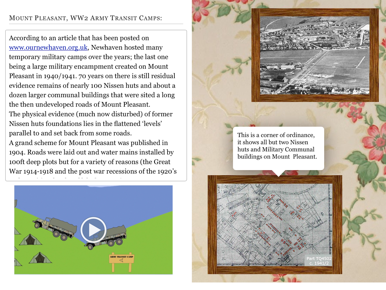
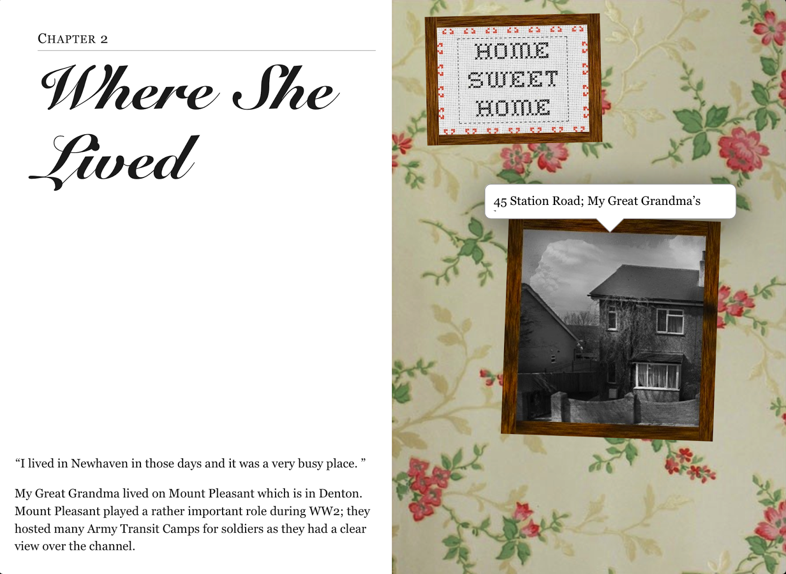
The second chapter of my book is about where my Great Grandma lived at the time in which she wrote the account.
In this page I have got some text about where my Great Grandma and a bit about the camps. There will be an image of her house and some ariel photos that I found during my research, finally there will also be the wallpaper background. I plan to use widgets on these pages so that when you tap on a image a pop up will come up with a caption about the image. This is the text that will be in section of the book:


In this page I have got some text about where my Great Grandma and a bit about the camps. There will be an image of her house and some ariel photos that I found during my research, finally there will also be the wallpaper background. I plan to use widgets on these pages so that when you tap on a image a pop up will come up with a caption about the image. This is the text that will be in section of the book:


The text on this page will be some quotes which I have taken from my Great Grandma's account and some of it will be based on the research that I have done on www.ournewhaven.org.uk.
The images on this page will be:


There will also be some audio in the chapter which will be part of the account.
This is what the pages looks like in iBooks:

This is how the beginning of the chapter looks. I created a widget for a pop up which I put on top of the image of her house. I typed in the text that I wanted and in the box I changed the opacity so that it could sit on top of the image.

Again I did exactly the same with creating widgets for the other two images. On final image I had it so that when you tapped on the image some audio played. To get it so that when you tapped it played, all I did was drag and drop the audio on the page and there was an option of how I wanted it to be displayed, I chose to have it displayed as an image which lead on to drag and drop the image that I wanted.
Subscribe to:
Comments (Atom)