
This is the third poster that I made and again it isn't quite finished. All that I need to do is to include some, which will explain briefly the image on the poster.

This is the colour scheme that I used for this poster. Again I decided to have a red background, which I think helps to make the yellowy cream colour to stand out. I chose blue for the colour of the circle, it stands out and makes you look at the image, but at the same doesn't really distract from the rest of the content on the page.
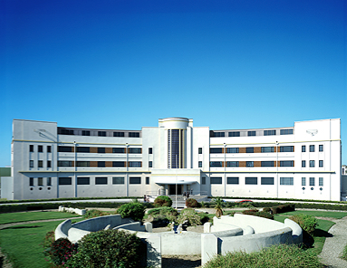
This is the image that I used to copy. I decided not to include the garden bit at the front, but instead just focus on the actual building.

This is the image that I made in Illustrator. I'm pleased with the outcome of it. When it came it to moving it on to the A3 page I found that length of the image was to long. What I decided to do was cut the ends of the image off and resize and move it so that it is in the centre of the page, I then placed another copy of the image on the page and made it smaller so that it fitted on. I thought that it would stand out better if it was in a circle, I placed these underneath the main image.

For the background I used the colour red. For the main colour I used a darker red and for the rays I went for a lighter red. Like with the previous backgrounds I changed the opacity of the spotlights to 70%.

I also placed my logo at the bottom of the page.
No comments:
Post a Comment