


 I used traced around the eyes and beak of the bird on the right and the wing of the bird on the left. I struggled with finding a bird which was pointing, but this is the closet image that I found. The screen shot of the bird on the right is what I used to draw the head.
After getting the outline of the image, I then went on to colour in the image. I chose quite a light blur for the head and face, whilst using a slightly darker for the shading on the hand. I then decided to use the dark blue from my colour scheme for uniform and then incorporating the using of the red in the band of its hat.

The screen shot above shows the three stages of doing the bird's face.

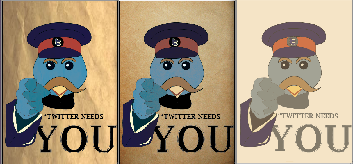
From the colour schemes that I chose, I then picked these five for colouring in the hat and the birds face. I decided to pick the lighter of the blue colours for the birds face, this is because in the original Twitter bird the colour of it is pretty bright, however for my poster I wanted the colour to be slightly darker so that it fits in well with the period that I am basing my idea on. It was quite hard to decide what colours to use for the hat and moustache because the original poster that I was copying from wasn't in colour so I had to make the decisions that I felt looked right. I picked the dark blue for the hat, I thought it fitted in with the army look and would stand out. With most of the WWI posters that I looked like the majority of them have the colour red in them, I thought that it would look effective if the band of the hat was the colour red. From the screen shot above you can see that the result was successful and the whole thing stands out.

After drawing and colouring in the face, I then moved on to draw the rest of the image. I used the image of the owl that I found on the internet and traced round that, I then moved it so that it was slightly over the birds face. From there I went on to use the 'Your Country Needs You' poster and traced around the sleeve of the man, I resized the image and then moved it so that it was in line with the pointing wing. I used the same blue as the face for the top part of the page and then a slightly dark shade for the bottom half to make it look as those the wing was pointing. I used the same blue for the sleeve that I used for the hat, and coloured in the detail and cuff with a yellowy colour, which you can see in the colour schemes above. I decided I didn't want it to be white because I thought it wouldn't really look as though it was from my intended period. The gap in the middle of the wing and sleeve, I coloured in grey which I think works well and looks better than if I had chosen to use black.


This is what my poster looks like along side the original. I am really pleased with the out come and I think that it fits in well with the requirements of the brief. After making the text I placed a brown square on top of the image and changed the opacity down, I did this to try and create an old look for the poster so that it looks more like my chosen period.
No comments:
Post a Comment