I think overall the project was pretty successful. I have enjoyed this project more than the previous one and I think that enabled me to show of my designing ability. The outcome of my poster was better than imagined it to be and I am pleased with what I achieved.
Using Illustrator was really good and I found it easier than Photoshop. As it was the first time of using it I found the tutorials really useful and helped me to develop my skills for making my own.
At the beginning I tried to keep on top of blogging, which worked but meant that I neglected doing very much in my sketch book. I think that my use of time was better than in the previous project and I managed to finish the presentation and poster by the set deadlines of pitching and criting. Near the end of the project I spent most of time focused on the practical side, which meant at the end it was quite a rush to catch up on the blog. For the next project I will definitely make sure I am more organized.
Monday, 28 November 2011

Crit
After showing my finished poster to the group this was the crit that I received:
- Age the poster
- Add a sepia effect
- Make the face bigger
- Make the beak look more 3D
- Move the beak up and more central
- Add a gradient on the face
- Sort the white bits
- Perhaps there could be a gradient on the background
- Text executed really well
- Like the idea
- Make the whole image bigger
- Can easily identify the chosen period
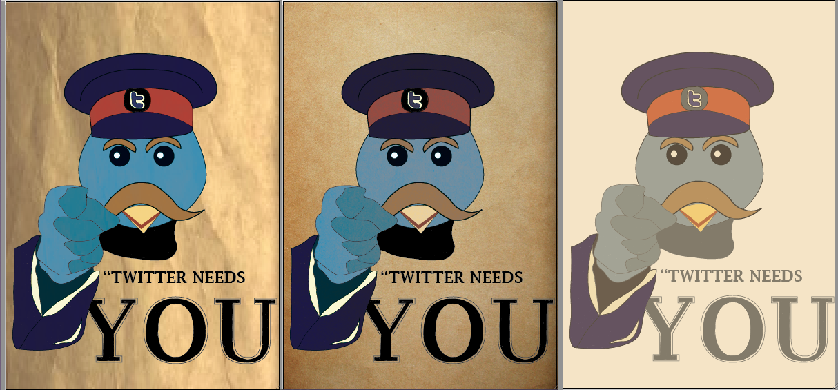
I was really happy with the points that I got back and they were really useful in ensuring I end up with a great finished poster. There was a balance of really positive points and points in which I could improve on. Now that I have received my crit, I can now make the changes that I need.
 Above is what my poster looks like now that I have applied the points that I received. I have tried to make the poster look more aged, which I think has been pretty sucessful. In this new version I decided to colour over the yellow bit that was on the front of the bird's hat, I think that it does look better with out although it still looked good with.
 The screen shot above shows the two things I changed after receiving my crit. The first thing that I did was make the whole image bigger so that it filled up most of the page, I am pleased I did this because it made the whole poster eye catching and it also looked clearer. The next thing that I went on to do was make the page look aged. To do this I used a gradient to change some parts to darker colours, which you can see the result above. I then went on to make the page look as though it has been ripped. To do this is used to the pen tool to make a straight line, then warping it to that it made a triangle shape, I then filled it with a lighter which helped to create the ripped look.
- Age the poster
- Add a sepia effect
- Make the face bigger
- Make the beak look more 3D
- Move the beak up and more central
- Add a gradient on the face
- Sort the white bits
- Perhaps there could be a gradient on the background
- Text executed really well
- Like the idea
- Make the whole image bigger
- Can easily identify the chosen period
I was really happy with the points that I got back and they were really useful in ensuring I end up with a great finished poster. There was a balance of really positive points and points in which I could improve on. Now that I have received my crit, I can now make the changes that I need.


Sunday, 27 November 2011
Making My Poster in Illustrator


 I used traced around the eyes and beak of the bird on the right and the wing of the bird on the left. I struggled with finding a bird which was pointing, but this is the closet image that I found. The screen shot of the bird on the right is what I used to draw the head.
After getting the outline of the image, I then went on to colour in the image. I chose quite a light blur for the head and face, whilst using a slightly darker for the shading on the hand. I then decided to use the dark blue from my colour scheme for uniform and then incorporating the using of the red in the band of its hat.

The screen shot above shows the three stages of doing the bird's face.

From the colour schemes that I chose, I then picked these five for colouring in the hat and the birds face. I decided to pick the lighter of the blue colours for the birds face, this is because in the original Twitter bird the colour of it is pretty bright, however for my poster I wanted the colour to be slightly darker so that it fits in well with the period that I am basing my idea on. It was quite hard to decide what colours to use for the hat and moustache because the original poster that I was copying from wasn't in colour so I had to make the decisions that I felt looked right. I picked the dark blue for the hat, I thought it fitted in with the army look and would stand out. With most of the WWI posters that I looked like the majority of them have the colour red in them, I thought that it would look effective if the band of the hat was the colour red. From the screen shot above you can see that the result was successful and the whole thing stands out.

After drawing and colouring in the face, I then moved on to draw the rest of the image. I used the image of the owl that I found on the internet and traced round that, I then moved it so that it was slightly over the birds face. From there I went on to use the 'Your Country Needs You' poster and traced around the sleeve of the man, I resized the image and then moved it so that it was in line with the pointing wing. I used the same blue as the face for the top part of the page and then a slightly dark shade for the bottom half to make it look as those the wing was pointing. I used the same blue for the sleeve that I used for the hat, and coloured in the detail and cuff with a yellowy colour, which you can see in the colour schemes above. I decided I didn't want it to be white because I thought it wouldn't really look as though it was from my intended period. The gap in the middle of the wing and sleeve, I coloured in grey which I think works well and looks better than if I had chosen to use black.


This is what my poster looks like along side the original. I am really pleased with the out come and I think that it fits in well with the requirements of the brief. After making the text I placed a brown square on top of the image and changed the opacity down, I did this to try and create an old look for the poster so that it looks more like my chosen period.
Proposal
From all the research and designing that I have come up with, I now have an idea for my Web 2.0 Social Media Propaganda Poster.
I have chosen to promote Twitter based from the period of WWI. I have chosen to base my idea from the 'YOUR COUNTRY NEEDS YOU' poster. I picked Twitter because I felt this would be the strongest social media to use as it gradually overtaking Facebook and the others with its popularity.
What I am planning on doing is replacing the man with the Twitter bird, which I think will be an effective design and would be appealing to people who use Twitter and people thinking of joining it. In my sketch book I have come up with a mock up of how I want my poster to look.
I have chosen to use the three colour schemes that I boxed in the previous blog and I am going to use 'Lucida Fax' as my font choice because I feel this will be easy and clear to read.
 The main images which will be used in poster is the Twitter birds face and pretty much everything that is in the 'Your Country Needs You' poster apart from the hand and face. I am going to use the letter 't' on the hat which will resemble the badge on the band of his hat. I am thinking of using the blue colours for the bird and for the uniform. Perhaps the darker blue for the clothes and a lighter blue for the bird which will fit with what the original looks like. I want to incorporate some red in my poster as I have noticed it is a common theme in the propaganda posters that I have looked at. From looking at the original poster I think the red would fit in well on the band of the hat. The lighter colours will be used for the shading and detailing of the bird. The 'Lucida Fax' is fairly similar to that which is used in the original and it is clear and easy to read, I think I will stick to the black font so that it stands out on the page.
I have chosen to promote Twitter based from the period of WWI. I have chosen to base my idea from the 'YOUR COUNTRY NEEDS YOU' poster. I picked Twitter because I felt this would be the strongest social media to use as it gradually overtaking Facebook and the others with its popularity.
What I am planning on doing is replacing the man with the Twitter bird, which I think will be an effective design and would be appealing to people who use Twitter and people thinking of joining it. In my sketch book I have come up with a mock up of how I want my poster to look.
I have chosen to use the three colour schemes that I boxed in the previous blog and I am going to use 'Lucida Fax' as my font choice because I feel this will be easy and clear to read.

Generating Ideas: Sketches
In my sketchbook I have been developing ideas and coming up with brainstorms to help me with my design. I have been copying already made posters and then practicing ideas before going on to draw it up in Illustrator. Above are a few screen shots of some sketchbook work that I have done.


Generating Ideas: Fonts and Colour Schemes
The next stage is looking up and deciding which fonts and colour schemes that I could use for my poster.
Colour Schemes
I found these colour schemes on www.kuler.com. On the website I searched 'Propaganda' and these were some of the colours that came up. I noticed that the colours were pretty much the same, focusing on reds, greens, blues and yellows. Once I had found these I wasn't sure which ones to use, so I thought that it would be a good idea if I was to use my WWI mood board and pick out the colours to make my own colour scheme, which I thought would be useful to get an accurate look for a poster from that period.
 These are the five colour schemes that I came up with. I picked out these colours from the WWI mood that I had made. The three colour schemes that I have boxed are the ones I am considering using, I think that I would incorporate these into my design and at the same time get the right feel for the period I have chosen.
Fonts

After looking at colours I then went on to look at different fonts. I found a selection of serif and sans serif fonts, which meant I had a good idea of which font would be the best to use. From my research I found that both sort of fonts are used, but I thought that the serif fonts would perhaps be better for a propaganda poster. I have two in particular that I like and I am considering using, American Typewriter and Lucida Fax, I have chosen these because I think they fit well with the period and at the same time is clear and easy for people to read when they come to look at the poster. I will also make the size of the font a fair size so that it stands out on the page.
Colour Schemes
 |
| www.kuler.com |

Fonts

After looking at colours I then went on to look at different fonts. I found a selection of serif and sans serif fonts, which meant I had a good idea of which font would be the best to use. From my research I found that both sort of fonts are used, but I thought that the serif fonts would perhaps be better for a propaganda poster. I have two in particular that I like and I am considering using, American Typewriter and Lucida Fax, I have chosen these because I think they fit well with the period and at the same time is clear and easy for people to read when they come to look at the poster. I will also make the size of the font a fair size so that it stands out on the page.
Generating Ideas: Web 2.0 Social Media
After coming up with a period that I wanted to focus on, I then went on to decide which Web 2.0 Social Media that I wanted to use. I initially wanted to use Twitter for my design but I decided to come up with mood boards, brainstorms and sketches for that and Facebook to ensure I make the right decision.
Above is some already made propaganda poster for Web 2.0 Social Media. These examples are helpful in seeing the types of things I could do for my own, and seeing that although you can have a simple design it will still look as effective.
Twitter

Mood Board
This is the mood board that I made for Twitter. I looked on the internet for the things that were relevant to Twitter and that would be instantly recognisable on a poster. If I was to pick Twitter than I think that I would focus more on the use of the bird and the letter 'T' as I feel these would be the best thing to represent Twitter.
Facebook
 Mood Board
This is the mood board that I made for Facebook. Although I found more pictures for Facebook, I feel that I am drawn more towards using Twitter as I already have some ideas for it. If I did decide to use Facebook I would base my idea on the use of the thumbs up symbol as this is pretty well known and would clearly represent Facebook in a Poster.
At the moment I think the Web 2.0 Social Media that I am going to use is Twitter. I instantly came up with ideas for this and I think that I will be able to come produce a better propaganda poster if I was to use this. In my sketch I am going to do sketches and brainstorms for both medias, but I will focusing more towards ideas for Twitter.
 |
| http://www.screenspace.org/wp-content/uploads/propaganda-posters-aaron-wood.jpg |

Mood Board
This is the mood board that I made for Twitter. I looked on the internet for the things that were relevant to Twitter and that would be instantly recognisable on a poster. If I was to pick Twitter than I think that I would focus more on the use of the bird and the letter 'T' as I feel these would be the best thing to represent Twitter.

This is the mood board that I made for Facebook. Although I found more pictures for Facebook, I feel that I am drawn more towards using Twitter as I already have some ideas for it. If I did decide to use Facebook I would base my idea on the use of the thumbs up symbol as this is pretty well known and would clearly represent Facebook in a Poster.
At the moment I think the Web 2.0 Social Media that I am going to use is Twitter. I instantly came up with ideas for this and I think that I will be able to come produce a better propaganda poster if I was to use this. In my sketch I am going to do sketches and brainstorms for both medias, but I will focusing more towards ideas for Twitter.
Friday, 18 November 2011
Generating Ideas: World War I
From coming up with my brainstorm and making a mood board, I decided to focus on World War I propaganda posters. I felt with the posters that I had looked at, I thought that I would be able to come up with the best ideas. I went on to then make another mood board which is just of World War I posters, this helped me to see the types of colours that I needed to use and the different layout styles.
 Mood Board
Above is the mood board that I came up with. There are quite a few posters from this selection that I like, in particular the 'We Can Do It' and 'Your Country Needs You' posters. I think that it helped me a lot making this mood board because I was able to visually see the types of characteristics that I needed to include in order for people to be able to recognise the period of my poster. I need to research serif and sans serif fonts because they are both used in the posters. I also need to think about the layouts, from looking at these posters most of them are divided by either having the text at the top and the image underneath or the other way around, also in some of them the image takes up most of the image and is the thing that is making the statement.
World War I Propaganda Posters
These are some examples of World War I propaganda posters that I have picked out from the mood board above. I have bullet pointed the characteristics, which I will need to take into consideration when designing my own poster.

From looking at this poster you can see that the overall poster is eye catching and bold. The use of font is sans serif which makes the text really clear and easy to read. The text is quite bold and the white is clear against the dark blue background. The yellow background makes the poster bright and instantly draws your attention. The image takes up most of the page and is helping to give over the message.

From looking at this poster you can see that the overall poster is not particularly eye catching but the design is simple and is gets the message across clearly. The use of font is serif which makes the text bold and stands out and it is also easy to read. The text is pretty clear against the plain background. The image takes up most of the page and is instantly directing the message of the poster to the audience.

From looking at this poster you can see that the overall poster is not particularly eye catching but the message that is being put across is clear and simple. The use of font is sans serif, which makes the text clear and easy to read. The blue text stands out fairly well against the pale coloured background. The page has been divided up, the picture is at the top of the page and the text is underneath which is one way in which I could lay out my poster. The image isn't that big but it clearly demonstrates what the man looking at the poster needs to do.

From looking at this poster you can see that the overall poster is quite busy and there is quite a lot happening although I think the message that is being put across is simple. The use of font is sans serif, which makes the text clear and easy to read. The yellow against the black background makes the text bolder and look a lot clearer. The page is divided, there is text at the top and at the bottom of the page and the picture is in the middle. The colours are fairly bright, especially the colour of the font. The image is pretty big and clearly shows what the subject of the poster is about.
Thursday, 17 November 2011
Generating Ideas

To help me come up with ideas I made a mood board. These posters range from World War 1 and II as I wasn't sure what period I wanted to base my idea on. I really like all of them and I think they all individually stand out. The colours are pretty much the same in each, using mainly yellow, red and blue, which I think are the main colours for a propaganda poster. The three posters in particular that I like are the 'We Can Do It', 'Your Country Needs You' and 'Keep Calm and Carry On' I think this is because these are the ones that I immediately recognised and I like the simplicity in the designs.

After making the mood board above, I then went on to make a brainstorm. In this I included the types of colour that I could use, the different periods and countries, the different web 2.0 social medias that I want to use and the types of text that I want to use. For the propaganda period I decided that I am either going to use World War I or World War II from either America or England. After making the mood board I found there was quite a few posters from these two periods that I liked, but I think that I am heading more towards the World War I side. I then went on to www.kuler.com which is where I found these five different colour schemes, in the search bar I typed in 'Propaganda' and these were some of the ones that came up, the colours are pretty much the same in each using mainly reds, blues, yellows and greens. There are two web 2.0 social medias that I want to focus on; Facebook and Twitter. I have chosen these two because these are the most popular ones and feel that I could be come up with the best ideas for a poster. I came up with a couple of characteristics for each, for Facebook I came up with the use of the word 'Like' and having an image of a thumbs up and for Twitter using the image of the bird and also the use of the hash tag and the '@' symbol. Lastly I then started thinking about potential layouts for my poster, having an image which will take up most of the page and also dividing the page up by having the image on one half and the text on the other.
Monday, 7 November 2011
Research: Web 2.0
What is Web 2.0?
“The term Web 2.0 is associated with web applications that facilitate participatory information sharing, interoperability, user-centered design, and collaboration on the World Wide Web. A Web 2.0 site allows users to interact and collaborate with each other in a social media dialogue as creators (prosumers) of user-generated content in a virtual community, in contrast to websites where users (consumers) are limited to the passive viewing of content that was created for them. Examples of Web 2.0 include social networking sites, blogs, wikis, video sharing sites, hosted services, web applications, mashups and folksonomies. The term is closely associated with Tim O'Reilly because of the O'Reilly Media Web 2.0 conference in late 2004.[2][3] Although the term suggests a new version of the World Wide Web, it does not refer to an update to any technical specification, but rather to cumulative changes in the ways software developers and end-users use the Web.”
http://en.wikipedia.org/wiki/Web_2.0
In my own words:
A site that is web 2.0 lets the users be able to interact and work together with each other in a social media dialogues creators of user generated content in a virtual community. Here are some examples of web 2.0; social networking sites, blogs, wikis, video sharing sites.
Web 2.0 can be broken down into three parts:
“Rich Internet application (RIA) — defines the experience brought from desktop to browser whether it is from a graphical point of view or usability point of view. Some buzzwords related to RIA are Ajax and Flash.
Service-oriented architecture (SOA) — is a key piece in Web 2.0, which defines how Web 2.0 applications expose their functionality so that other applications can leverage and integrate the functionality providing a set of much richer applications (Examples are: Feeds, RSS, Web Services, Mash-ups)
Social Web — defines how Web 2.0 tends to interact much more with the end user and make the end-user an integral part.”
http://en.wikipedia.org/wiki/Web_2.0#Concepts
The social web is one of the important parts of Web 2.0, which is an essential way in which people communicate. There are a number of tools in which people can use so that they can share their perspectives, opinions, thoughts and experiences. Web 2.0 applications tend to interact much more with the end user. The end user is not only user of the application but it also a participant by:
- Podcasting
- Blogging
- Tagging
- Contributing to RSS
- Social bookmarking
- Social networking
 |
| http://oreilly.com/web2/archive/what-is-web-20.html This chart shows one application or approach as Web 1.0 and another as Web 2.0. |
 |
| Above is a brainstorm which I made that shows examples of Web 2.0 Social Media. |
Subscribe to:
Comments (Atom)