I needed to think about getting the relevant bits together in order to film, I needed some black card to use as the background, a fish bowl, stones, plant and some models to put inside the bowl. Whilst I sourced these things I sketched in book some plans and idea of how I was going to film it as well as setting out the scene.
Saturday 6 April 2013
Next Steps
Once I pitched my ideas and decided on the one I wanted to go with, I then went on to think about the next steps towards the development.
Friday 5 April 2013
Pitch
This is the pitch that I put together to show Val. Out of the three ideas that I came up with, I decided to show her two of them, I thought that it would be useful for me to do this so that I could have her thoughts and opinions on both the ideas.


These were the two ideas, which I showed. Out of these ideas, I personally preferred the fish tank idea however I felt that I wanted to hear Val's opinion of this idea and also of the shadows idea and to see which idea she preferred and liked.

I started off with showing the 'Buildings/ Places and Shadows' idea. I broke the idea up into some points and explained the concept and what I've done initially.

I included some of the sketches that I came up with whilst I was starting to develop the idea.

I then showed some more sketches from where the idea began to develop.

I showed a rough storyboard showing how the ident would run, in relation to the sun rising and setting.

In After Effects I came up with a rough mock up to show how the idea would work.

I then went to show my second idea of the 'Fish Tank.' Like with the previous idea I broke it down into a few points and explained the concept of the idea.

After explaining the idea, I listed some ideas of things that I could put inside the tank.
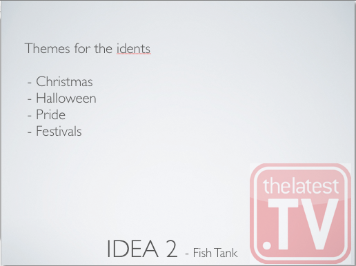
I then listed some themes for the idents.

I showed some sketches of my initial ideas for the fish tank.

I showed another sketch of a longer tank to give more of an idea of how it could look with the bits inside the tank.

In relation to the previous sketch I came up with a storyboard to show how it would work.

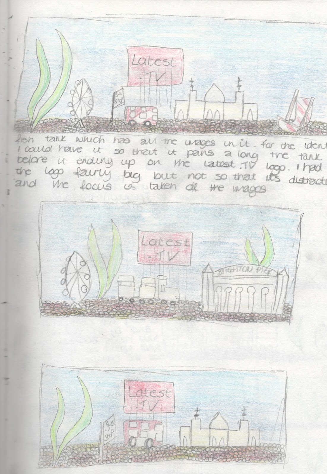
I showed of a longer tank with different things in it, to give more of an idea of how it could look with the bits inside the tank.

Again I came up with another storyboard to go with the previous sketch.

I showed a third sketch of a long tank with different things in it.

I did a storyboard to go with the third sketch.

I didn't make an animation mock up in After Effects, instead I came up with a rough still using Photoshop.
Feedback
I received some good and positive feedback towards my ideas, which was helpful in me moving forwards to doing the final idents.
These were the points that I received:
- Work on art style
- Go with the fish tank idea
- Could have them in a marble/ snow globe rather than a fish tank
- Could spray the models white
- Need to go out a find models
- Maybe have a scene like in the lanes and zoom out to find that it is in a tank
- Look for After Effects tutorials for underwater scenes with light rays and bubbles
Third Idea
Finally my third idea is based on what I came up with second idea.


Using the same concept of different places around Brighton, with this idea the text would appear with the use of light and shadows. Above is a rough storyboard of where the sun and the shadow would be.


These are some still from the rough mock up made in After Effects. It shows the lighting changing which is revealing shadow and the text. I would do the same thing using a different location like the beach or the lanes.
Second Idea

Another idea that I had was the letters falling onto the ground of different places around Brighton. The obvious three that I have sketched is the beach, the wheel and the pavilion. I was thinking of having each letter falling down from the top of the screen, where the colour of the text will be red.
One Idea
Fish Tank

After my initial sketches, I did a mini brainstorm of some things that I could put inside the tank. The main concept that I was thinking of with this idea is replacing ornaments which you would find in a fish tank, like a castle for example and replacing the ornaments with places and things which link with Brighton. A bus, big wheel, bus stop, seagulls, deck chairs, ice cream van, pavilion, fish plants and sign posts were some of the things that I first thought of to put in the tank.

http://www.google.co.uk/search?q=fish+bowl&source=lnms&tbm=isch&sa=X&ei=RySNUbXHCeii0QWs44DwBw&ved=0CAcQ_AUoAQ&biw=1129&bih=620#tbm=isch&sa=1&q=fish+bowl+biorb&oq=fish+bowl+bio&gs_l=img.3.0.0i24.22354.24242.0.25472.6.6.0.0.0.0.108.449.3j2.5.0...0.0...1c.1.12.img.YIjIg0hFSqI&bav=on.2,or.r_qf.&bvm=bv.46340616,d.d2k&fp=6ff9759cdf5c2792&biw=1129&bih=620&imgrc=WXA-c-6FNHe88M%3A%3BQrsdJ8B_-6ZlRM%3Bhttp%253A%252F%252Fwww.wilko.com%252Fcontent%252Febiz%252Fwilkinsonplus%252Finvt%252Fwc00008%252Fwc00008_l.jpg%3Bhttp%253A%252F%252Fwww.wilko.com%252Ffish%252Fbiorb-60ltr-coldwater-aquarium-kit-silver%252Finvt%252Fwc00008%3B1000%3B1000

http://www.google.co.uk/search?q=fish+aquarium&hl=en&source=lnms&tbm=isch&sa=X&ei=DSmNUbnyBsaa1AWA_IHoAw&sqi=2&ved=0CAcQ_AUoAQ&biw=1129&bih=618#imgrc=hr3NNRD_qCnyXM%3A%3BYtMe4hacIPNLXM%3Bhttp%253A%252F%252Fdigitalphotography.blogmonster.net%252Fwp-content%252Fuploads%252F2011%252F03%252Faquarium-photography.jpg%3Bhttp%253A%252F%252Fdigitalphotography.blogmonster.net%252Ftag%252Ffish-tank%252F%3B2816%3B2112
I sketched a few rough ideas of how the sign would look alongside the places/ things relating to Brighton.


I continued to draw some more fish scenes.

These are three storyboards which I drew up. Each scene has different things inside the tank but the idea of each one are the same.
Initial Sketch Ideas

These were some initial sketches that I came up with after brainstorming some ideas and having had the visit from Latest TV.

An idea that I was thinking of was having the words 'Latest TV' falling down from the top of the screen and landing on top of each other. Once the letters have all dropped down, they rearrange so that they are sitting straight.

Another thought that I had was having a fish tank scene, with the words 'Latest TV' sitting at the bottom of the tank. Because of the station colours being red and white, I was thinking of having the colour red being dripped into the tank or having the screen filling up with red liquid. Whilst the tank is filling up with red liquid, the letters will go red.

The words could be in the centre of the tank and could be attached with sticks which would be placed in the stones. Alternatively the words could fall into the tank and then sit on the stones.
Ideas - Station Idents
Having had the meeting with Latest TV, we knew some of the requirements which need to be in the station idents.
- They can say both '8' or 'Latest TV' or can combine both and say something to the effect of 'You are watching Latest TV on Channel 8'
- May need idents when the continuity says what's coming up now or later
- Latest TV colours tend to be red and white, using the font Verdana
- Duration of the idents; 1-10 seconds
- Branded Latest TV stills or with movement to use as break bumpers and between
- Stand out stuff that say who we are
- Perhaps changing with the seasons or months and/or to account for whatever is going on in the city or on the channel
These are some of the initial ideas that I came up with:
- Thinking about imagery; seagulls, pavilion, pier, wheel, festivals, pier, beach, windmill, football, station, buses, fashion/ individuality, pride
- The main colours being red and white; could have the images in red and white
- Could just have the words 'Latest TV'
- No images, just patterns
- Could have the words 'Latest TV' clear and have a trail of red and white go towards the middle where the words are and the words start filling the words up with red.
Research
These are some existing TV idents that I had a look at:
This is a show reel of idents from BBC 2 dating between 2001-2007 that I had a look at a. In the clip it shows different idents that they have used but all based on the same type of theme, which is the use of the number 2 along with colour yellow.
Another set of idents that I looked was the new 2013 idents that ITV have just released. I had a look on the ITV website and had a read about the rebranding and the idea behind it was that it was 'designed to position ITV as "a brand at the heart of popular culture." ' (http://www.itv.com/news/2013-01-14/new-itv-logo-rebrand-2013/)
Notes
Notes taken during lesson:
Types of shows:
News
Reviews (Brighton Lights)
Comedy (SIK)
Gossip/ Trivia/ Celebrity (Deep and Meaningless)
Political (The Vote)
Magazine (City Of...)
Looking at idents...
News - Global/ Information Graphics/ High Tech/ 3D/ World
Comedy - Bright/ Colourful/ Visual Jokes/ 3D/ Fun/ Quirky/ Surprise
Review - Elegant/ Sophisticated/ Design/ Short/ High Quality
Gossip/ Trivia - Bright/ Gaudy/ Fast Pace
Subscribe to:
Posts (Atom)