This is the code for my website.
html
This is the html code for my site. To begin with I created the basic layout in which I made a header, a main content section and a footer.

The screen shot above shows the top of my html.

At the top of the html in the <head> I have put in all of the jquery and links to other pages.

In the body tag I made another tag called wrapper and inside that is where I have put in all of my content. The first thing that I put in my <wrapper> is the title, because each word needed to be different I put each word in an unordered list.

This is what my title looks like in my html. Now that I have done this I need to go on to style it in my css, I need to change the fonts, colour and rotate some of the words. In my mock up I wanted to have a border along the top and bottom, so in my html I made a <div> with an id of "border" and placed the unordered list inside this <div>. In css I will style the border.

As well as having the title in the header I also wanted to have the horizontal navigation in there so that it sat along the top of the page. I made another <div> with an idea of "horizontal" and inside that made an unordered list with a class of "nav" with the headings for my section and where the links are aimed at. In my design I had the use of lines between each box so I tried out having the links to go the lines and found that it worked successfully. I'll be styling my horizontal navigation in css. At the end of the horizontal div I closed the header div like this; </div><!--end of header--> the comment at the end was to help me what the end div was for.

After completing the header I then moved on to make <div> with an id of "main_content". This <div> will contain all of my content that I want, the first thing that I add was my vertical navigation. I did the exact same thing as I did with the horizontal navigation, however I just changed the id of the <div> that it was in to "vertical". I need to style this in css to fix it to the left hand side of the page.

This screen shot shows the next part of my html.

The next thing that I put in the <div> was an image which is located in an images folder with a folder which contains the html and a folder for the css. I made a new <div> with an id of "bunting" and a class of "section" so that I could style it in css and put in the code <img src="images/big_bunting.png" alt="" /> I then closed the div and added a comment. After that I then added another <div> with an id of "line_1" and then closed it and gave it a comment, I will need to style it in css to give it a height, width, colour and changing positioning. This line is where my first link on my navigation will go to. The next <div> that I added was for my section of the site, I gave it an id of "bio" in which I included a title and some text.

Underneath the "bio" box I created another <div> which I gave an id of "line_2" and set it out exactly the same as "line_1", this line is used for the 'Photoshop' link on the navigation. The next section that I wanted was for Photoshop so I created a <div> with an id of "photoshop" and a class of "section". Inside the <div> I created a paragraph tag in which it will contain some text that will explain the project brief and what I think about Photoshop. The next thing that I added was another <div> this time with an id of "switcher", this <div> contains my panoramic photos and I will be styling it in css to make it an image switcher.

After that I went on to add another image, a line and another section to my site.

I created a <div> with an id of "owl_branch", which is the same name as the saved image and entered this bit of code <img src="images/owl_branch.png" alt="" />. Under that I created another <div> for the third line. I did the exact same thing as I did with the Photoshop part, however I just changed the idea to "Illustrator. Inside the <div> I made a title and paragraph tags and then after that made three separate <div>'s to put in images of my work.

The screen shot above shows my images of my work inside the three <div>'s.


Underneath the <div>'s is some java script which is used to get my light box to work, which I have been struggling with. I then ended the <div> and added another image with another line.
The next section that I added was for Final Cut.


This is the code that I used to add my video of my speech clip. In my folder which contained my html (index.html) and the folder with my images in, I made another folder which I named 'video' which contained an mp4 and ogg version of my video.

After adding my video I then went on to add another image and another line, which is used for the link on my navigation.

Underneath the image and the line I made a new <div> and gave it an id of "web" this is going to be my last section to my site. I put in a title and some text about what I have done in web and a bit about the brief of the project.

I then went on to add three images of the website that I had made, which I put under the text and then after that I put a link which will take you to my website that I made for the project. Inside my website folder I put in a copy of my other website which I then used as part of my link to get on to it.

The next thing that I did was put in some java script for the light box for the images that I just put in.
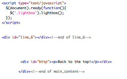
I put in another line and then ended the main content <div>.

After ending the main content <div>, I then went on to make a new <div> with an id of "footer". Inside that I created a link which would take users back to the top of the page. I created an arrow which is used as button for the link. Once I had made the link I then put my name in the footer box and my email address. Lastly I closed the footer <div> and ended the wrapper <div>.

The final thing that I did in my html was add the relevant jquery to go with the navigation and images.
css
Alongside doing my html I used the css to style all the content that I have put in.


The first that I did in css was add a background. In Illustrator I made a small square with the colour that I wanted and gave it a film grain effect and then saved it for web and devices. Back in css I put in:
background: url(../images/beigebackground.png);
I then went on to repeat the background on the x and y axis.

I went on to give the header a height and background colour. I initially used the colour as a guide so that I could see on the page, however once I had put in my title and horizontal navigation I got got rid of the background by putting in this; /*background: #ffffff;*/. After that I then went on to style the border. As a <div> in html there was nothing when I opened it up in Safari, so in css I gave it height of 240px this is so that the title would fit in between. I gave it a width of 494px, I did experiment with different measurements before deciding on this one, I then gave it a border width of 8px as I didn't want the border to be overly thick. I chose a colour for it and gave it a border style of solid.

After styling the border I then moved on to the title, I gave it the same height and width as the border and positioned it so that it was on the left hand side of the page.

I then went on to style each word. I wanted each one to have a different font and style so I needed to individually sort them out. You can see in the screen shot above how I styled the first two words in my title.

This is how I styled the other two words of my title. For the word 'web' I needed to rotate it, you can see the code for it above.

This bit of styling is for the horizontal navigation bar. I didn't need to do much styling apart from positioning it so that it was on the right hand side and had a background image which I had saved in the images folder.


Above you can see the styling for the text of the horizontal navigation. I changed the font, positioning, line spacing and margin.

I then moved on to style my vertical navigation.

I did about the same amount of styling as I did with the horizontal navigation.

After styling the navigation and header, I then moved on to the main content. You can see in the screen shot this is the styling for the bunting image.

This bit of styling is for the lines on the pages which are used as of part of the navigation.

I then moved to style the images that I put in to page, all I needed to do here was just sort out the positioning and margin of each one.


This bit of styling are the for the content boxes for each section. I gave them the same coloured background, margin and positioning, however even though they have the same width the height of some of them vary depending on the content inside each one.


I moved to sort out the headings for each section. I used the same bit of code as I used for the heading to rotate them slightly. I changed the font size, colour and the font to 'Cooper Black'


This bit of styling is for the panoramic pictures that I wanted as an image switcher.


This bit of styling is for the images which are in the Illustrator section of my site.

I wanted to position my video in the centre of the section of 'Final Cut', so I experimented with the left margin and the top margin to that it was at the bottom of the box and I could then put text above it.

The final bit of styling is for the footer. I changed the colour of it and changed the positioning of the text that was in it.
No comments:
Post a Comment