Friday, 18 January 2013

YCN Briefs

I was able to view the YCN briefs on their website: www.ycn.org

From looking on the site, I found that there was 21 companies which all had briefs. The companies are really varied so there is quite a choice to choose from, however each require different skills and focus on particular things so I need to have a good read through and make sure I pick the right brief. 
In groups and then as a class we had a look through each brief individually and discussed which ones we preferred and which ones we didn't really like the sound of that much.

Here are the companies which have set the briefs:
  • Bacardi
  • British Eurosport
  • Churchill
  • Douwe Egberts 
  • Ella's Kitchen
  • Experian
  • Fedrigoni
  • Forestry Commission England
  • Goji
  • Lego
  • Mariott Hotels and Resorts
  • Nissan
  • Plan UK
  • Reading and Leeds Festivals
  • Royal Court Theatre
  • The Feel Good Drinks Company
  • UGG
  • UK Greetings
  • Very
  • Yahoo
  • Yell
I have highlighted the three briefs that stood out for me. 

Project Two: YCN Awards Brief

The Brief

YCN is a design agency, which describes itself as 'Producing work across all media and representing the finest creative people for commissions and collaborations'. They say of themselves that 'YCN today produces advertising, design and other creative communications n all media; both for its own projects and ventures and on behalf its various clients'. They are a 'group of designers, art directors, developers, writers, illustrators and project managers work together at 72 Rivington Street in London'. They also run an annual competition which offers students the chance to fulfil creative briefs from a range of high profile clients and enter that work in a competition. 'The YCN Student Awards shine a light on new creative talent and centre on a collection of live creative briefs'. (http://www.ycn.org)

Winning a competition such as this one often results in the work being commissioned commercially and is a good career starter.

We will be visiting YCN to discuss the briefs and the competition on Monday 14th January. This trip to London is a required part of this assignment, so make plans to be available and able to travel that day.

For this assignment you will choose from a list of YCN Award brief. The internal deadline for your degree assessment is in advance of the YCN submission deadline, which is March 14th 2013. It is recommended, but not compulsory, that you enter your work into the competition.

Sketch book and Blogs

You are required to keep a sketchbook/ visual diary to record the generation of ideas and the progress, development and evolution of your project.
In addition you should set up a process blog to hold idea, techniques and examples of any contextual references (art and design styles) that you have researched, together with links to media sources used for inspiration.

You are expected to bring your sketchbook to every session for viewing by your tutors and to update your blog at least weekly.

Requirements

Your research, design and planning needs to be shown in a combination of sketchbook and blog showing three initial ideas designs then full deign development for your chosen brief (eg. further sketches, storyboards, animatics, mock ups, flow diagrams).
You will pitch your designs in development as a prepared presentation.
You will develop a pdf document based on the guidelines set by YCN which is ready to submit as part of your YCN Award submission.
You will submit your finished digital products in suitable formats on the Hercules server.

Deadlines and Key Dates

Mondays 14th January - Visiting YCN in London
Wednesday 16th January - Put forward three initial ideas in response to your chosen brief for discussion
Wednesday 6th February - Full pitch of idea
Monday 25th February - Crit
Wednesday 27th February - Hand in project

Wednesday, 12 December 2012

Evaluation

Overall I have enjoyed this project, however if I was to do it again I would definitely do it all differently. I don't think I went about it the right way especially when it came to the length of time we had for the project. I think because it was so long I kept putting things which wasn't the right thing to do, this mainly happened near the end of the project though.
At the beginning of the project I was pretty organised and managed to come up with an idea fairly quickly and managed to gather quite a bit of images and documents which was really helpful, I blogged at least once a week and was making good progress. I think the down fall for me was after the pitch. I think that I would have benefited from making more deadlines for myself to ensure I finished everything in good time. 
One of the main problems that I have had throughout the project is the use of After Effects. As I had never used this software I wasn't at all confident with it and didn't really know what I was doing. I found we didn't have many tutorials with it, and found that I was constantly putting off the idea of using it, which I found wasn't a really good plan. By the end of the project I started to get to grips with, but I think this would have been more useful earlier on in the project. On the other hand I found using iBooks pretty simple and didn't really have a problem with using and I am pleased with the out come of my book. 
I also found I used my sketch book a lot more with this project, compared with previous projects where I haven't really filled it. I found it really helpful with this project and it helped with designs and content.
I will definitely take away a lot from this project and apply it to the next project, mainly the use of scheduling.

Time Schedule/ Management

Looking back at this project I think that I could have used a time schedule in a more effective way. I think because of the length of this project it would have more useful to me to have set myself deadlines in order for me to keep up to date with the project rather than just aiming for the key dates that were set in the brief, like the pitch, crit and deadline.


Above is a time schedule that I made. The dates in red are the key dates that were put in the brief. Like I said at above, I think that I would have benefited from setting myself more deadlines to ensure that I was up to date through out the project especially as the length of the project was quite long. 
Nearer the end of the project I made myself another project schedule which I drew up to help with getting my project finished. Below is a screen shot of it:

Final eBook

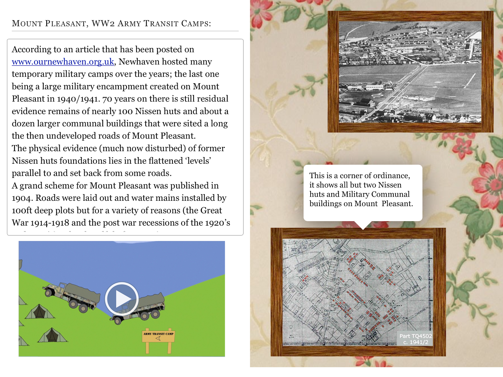
This is what my final eBook looks like now that I have made those changes.


Tuesday, 11 December 2012

User Testing

Having had crit and seeing people use my eBook, I now have a better idea as to how I can improve the usability of my book to make some of the content clearer. The crit was a good test of the usability of my book and now I can make the right changes to hopefully improve it.
Since making the changes, I have had some family members try out my book. They found it easy to navigate and go through each page. They knew where about the audio was throughout the book and were able to clearly read the font. 

Changes


I have now done the changes to my eBook and I am really pleased with the outcome.

One of the first things that I changed was the font size. Originally when I made my book, I had the font size at 16 which didn't seem to be that small, however during crit it was pointed out that it could be a little bigger so I decided to change so that it is now 18. There is noticeable between the two sizes and the 18 is definitely seems to be easier to read.
The next thing that I changed was the 'Bio' page. Originally I had two double page spreads, the first two had some text and the wallpaper and the second some more text and the wallpaper. During crit it was suggested that I change this and have everything on one page. To change this, in iBooks author I added a widget and I selected the scroll box, I copied and pasted my text into the box and resized it and positioned it to where I wanted. 


The screen shot above shows what the 'Bio' page now looks like. Where the text is there is now a scroll. I think this change works better than how I first had it as all the text is now together instead of being separated.
I then went on to move all of my pages so that they're all in one chapter instead of having each part in its own chapter. By doing it means the navigation will be easier and the links to each page will work.


This is how I originally had my chapters and how the contents page was set out, which meant the pages didn't link to each other.


This is what it looks like now that I have changed it. I have done it so that everything is in one chapter and now when you click on one of the links it take you to the different sections, whereas before it didn't.


Another comment that I got was that there was quite a big gap between the title and the text so I have now moved the text so that it is just underneath the heading and have also added some more text underneath it.

This is what the page now looks like.

Another point that I received was that I needed to make the fact that there was audio on the page clearer. It was suggested that I could use a gramophone to indicate there was sound. I experimented in Photoshop and came up with this:


and this is what they look like on the pages


During crit it was suggested I have interactive images right from the beginning of the book, instead of a couple of pages in so I changed it so that now when you click on the picture of my Great Grandma a speech bubble comes up with some text.


This is what the page now looks like.

The last thing that I did was finish the animations and added them to the eBook.