Thursday, 1 December 2011

Project Three: Branding and Promotion - Urban Regeneration


The Brief 
"Inner cites changed enormously in the 90s and 00s, with run down areas of disused buildings and land, and in some cases substandard housing, being redeveloped into pockets of urban cool, featuring flats, shops, hotels, restaurants, venues and conference centres, with the intension of breathing new economic life into the previously derelict.  In Brighton, two examples of this are the area around the Jubilee Library and the New England Quarter at the back of the train station.  Further afield, the work of Urban Splash has redeveloped areas of English northern cities.

This kind of regeneration has slowed right down in the current recession, but for this assignment you have to imagine that London Road Brighton is being redeveloped into a gentrified urban centre attractive to the young and single or couples without children.  Flats, bars, restaurants, shops, a hotel and a club / music venue are designed to be attractive to the target market of 18 – 39 year old well off students and professionals. 

You have been commissioned to create the graphic design for the promotion of the London Road Brighton project.  You need to develop a consistent visual language across a range of print pieces, using typography and a graphic style in a way that creates a visually coherent campaign.  You need to produce a folding leaflet which promotes the project overall combining text and images, and a series of at least three magazine ads or posters which focus on a specific aspect of what’s on offer in the zone (such as a bar, the hotel and the flats).  The ads are for distribution as full page ads in relevant magazines including Time Out in London and Latest 7 in Brighton.  The posters are to be placed in London and Brighton bus stops and train stations, and London Tube stations.  You will need to create these print pieces at suitable aspect ratios and mock them up into a photo of a location or magazine to show their impact in situ. 

You will start this project by undertaking visual research.  As well as looking at existing posters, magazine ads and leaflets for their design characteristics, you will look into the visual presentation of architectural and urban regeneration projects, and you will also explore the work of artists, designers, design movements and images to select a visual language that will inspire and inform your work.  This research needs to be reflected in your blog. 

You will devise the concept for your campaign (inspiration, imagery, tag line, colour, font, layout etc) from research and design development processes including brainstorms, mood boards, sketches, mock-ups etc and pitch this concept to the group and your tutors for discussion.  Your design development work must be shown in your sketchbook. 

You will use any combination of Photoshop and Illustrator to produce the artwork for this project.  The leaflet must be laid out and typography incorporated in InDesign. 

You will show your completed artwork to the group for critique, justifying your design decisions and looking for potential improvements.  The crit feedback needs to be written up on your blog.  Once improvements have been made in response to the crit, you need to print your artwork to put in your sketchbook.  These do not have to be printed at full size for the poster; you can print at A3.  The leaflet printed double sided and folded.  You need to get your printing done externally at a print shop (Blow up in Brighton and The Print Room in Lewes are recommended)."  

Monday, 28 November 2011

Evaluation

I think overall the project was pretty successful. I have enjoyed this project more than the previous one and I think that enabled me to show of my designing ability. The outcome of my poster was better than imagined it to be and I am pleased with what I achieved.
Using Illustrator was really good and I found it easier than Photoshop. As it was the first time of using it I found the tutorials really useful and helped me to develop my skills for making my own.
At the beginning I tried to keep on top of blogging, which worked but meant that I neglected doing very much in my sketch book. I think that my use of time was better than in the previous project and I managed to finish the presentation and poster by the set deadlines of pitching and criting. Near the end of the project I spent most of time focused on the practical side, which meant at the end it was quite a rush to catch up on the blog. For the next project I will definitely make sure I am more organized.

My Propaganda Poster


Crit

After showing my finished poster to the group this was the crit that I received:
- Age the poster
- Add a sepia effect
- Make the face bigger
- Make the beak look more 3D
- Move the beak up and more central
- Add a gradient on the face
- Sort the white bits
- Perhaps there could be a gradient on the background
- Text executed really well
- Like the idea
- Make the whole image bigger
- Can easily identify the chosen period
I was really happy with the points that I got back and they were really useful in ensuring I end up with a great finished poster. There was a balance of really positive points and points in which I could improve on. Now that I have received my crit, I can now make the changes that I need.
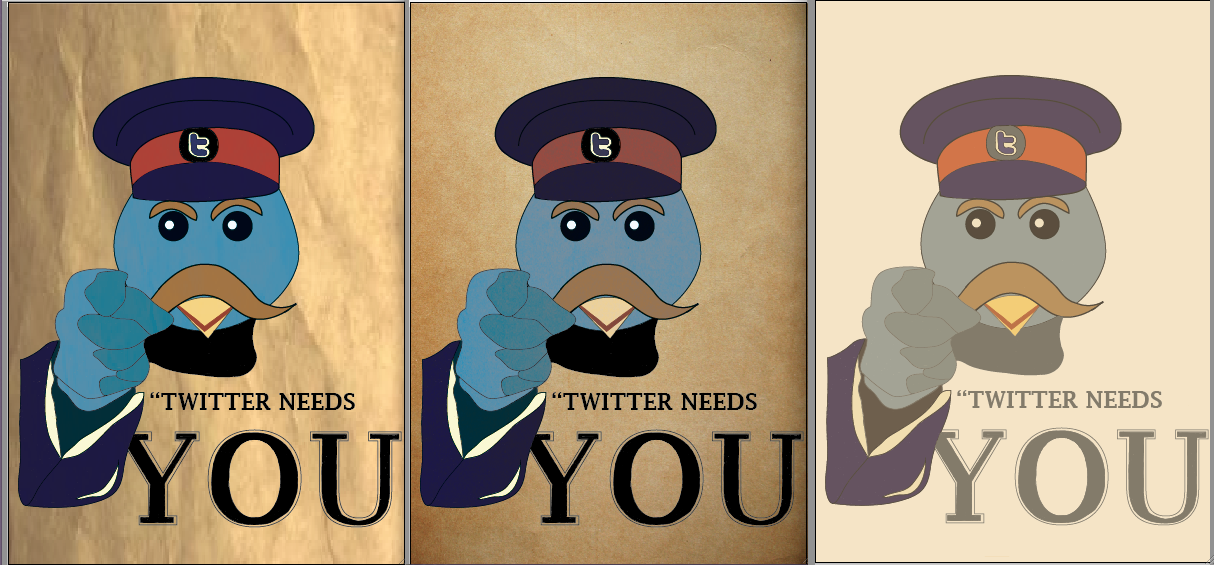
Above is what my poster looks like now that I have applied the points that I received. I have tried to make the poster look more aged, which I think has been pretty sucessful. In this new version I decided to colour over the yellow bit that was on the front of the bird's hat, I think that it does look better with out although it still looked good with.
The screen shot above shows the two things I changed after receiving my crit. The first thing that I did was make the whole image bigger so that it filled up most of the page, I am pleased I did this because it made the whole poster eye catching and it also looked clearer. The next thing that I went on to do was make the page look aged. To do this I used a gradient to change some parts to darker colours, which you can see the result above. I then went on to make the page look as though it has been ripped. To do this is used to the pen tool to make a straight line, then warping it to that it made a triangle shape, I then filled it with a lighter which helped to create the ripped look. 

Sunday, 27 November 2011

Making My Poster in Illustrator

This is what my final poster looks like. I found using Illustrator really good and I found that I was at ease with using it considering it was the first time I had.

The screen shot above shows the first stage of making my poster. I placed the original poster in the centre of the page and using the pen tool, I drew around the hat, eyebrows, moustache, neck and sleeve, which you can see above.
I used traced around the eyes and beak of the bird on the right and the wing of the bird on the left. I struggled with finding a bird which was pointing, but this is the closet image that I found. The screen shot of the bird on the right is what I used to draw the head.


After getting the outline of the image, I then went on to colour in the image. I chose quite a light blur for the head and face, whilst using a slightly darker for the shading on the hand. I then decided to use the dark blue from my colour scheme for uniform and then incorporating the using of the red in the band of its hat. 
The screen shot above shows the three stages of doing the bird's face. 
From the colour schemes that I chose, I then picked these five for colouring in the hat and the birds face. I decided to pick the lighter of the blue colours for the birds face, this is because in the original Twitter bird the colour of it is pretty bright, however for my poster I wanted the colour to be slightly darker so that it fits in well with the period that I am basing my idea on. It was quite hard to decide what colours to use for the hat and moustache because the original poster that I was copying from wasn't in colour so I had to make the decisions that I felt looked right. I picked the dark blue for the hat, I thought it fitted in with the army look and would stand out. With most of the WWI posters that I looked like the majority of them have the colour red in them, I thought that it would look effective if the band of the hat was the colour red. From the screen shot above you can see that the result was successful and the whole thing stands out. 
After drawing and colouring in the face, I then moved on to draw the rest of the image. I used the image of the owl that I found on the internet and traced round that, I then moved it so that it was slightly over the birds face. From there I went on to use the 'Your Country Needs You' poster and traced around the sleeve of the man, I resized the image and then moved it so that it was in line with the pointing wing. I used the same blue as the face for the top part of the page and then a slightly dark shade for the bottom half to make it look as those the wing was pointing. I used the same blue for the sleeve that I used for the hat, and coloured in the detail and cuff with a yellowy colour, which you can see in the colour schemes above. I decided I didn't want it to be white because I thought it wouldn't really look as though it was from my intended period. The gap in the middle of the wing and sleeve, I coloured in grey which I think works well and looks better than if I had chosen to use black.
After making the bird, I then went on to make the text. I used the text tool and changd the font to Lucida Fax and typed in 'YOU'. Because I wanted the text to look pretty much exactly the same as the original and I couldn't find any font that was similar I decided to make it myself. Once I had typed in you, I switched the fill of the text so there wasn't any and instead was just an outline. I then went out to draw inside the letters that it was filled in the centre of each but still had the white outline. The screen shot above shows the results, which I am really pleased with and think that it looks close to the original.
This is what the text looks like next to the image. I am pleased with the outcome and I happy with the fact it is clear and easy for people to read when they come to look at the poster. I think the size is just right and doesn't really distract from the image.
The final thing that I went on to do was try and make the poster look quite old. The screen shot above shows three different ways in which I could have it. I decided to go with the third image, which is just a brown box in front of the image and just having the opacity turned down slightly so that you could the other images.
This screen shows my layers bar. I tried to keep this fairly organised so that if I needed to go back to a certain layer it would be easy to find. I labelled each layer which was a great help as I found myself going back to different layers once or twice. I also made separate layers for the fill of each shape which was another thing that I felt was useful.
This is what my poster looks like along side the original. I am really pleased with the out come and I think that it fits in well with the requirements of the brief. After making the text I placed a brown square on top of the image and changed the opacity down, I did this to try and create an old look for the poster so that it looks more like my chosen period.


Proposal

From all the research and designing that I have come up with, I now have an idea for my Web 2.0 Social Media Propaganda Poster.
I have chosen to promote Twitter based from the period of WWI. I have chosen to base my idea from the 'YOUR COUNTRY NEEDS YOU' poster. I picked Twitter because I felt this would be the strongest social media to use as it gradually overtaking Facebook and the others with its popularity.
What I am planning on doing is replacing the man with the Twitter bird, which I think will be an effective design and would be appealing to people who use Twitter and people thinking of joining it. In my sketch book I have come up with a mock up of how I want my poster to look. 
I have chosen to use the three colour schemes that I boxed in the previous blog and I am going to use 'Lucida Fax' as my font choice because I feel this will be easy and clear to read.


The main images which will be used in poster is the Twitter birds face and pretty much everything that is in the 'Your Country Needs You' poster apart from the hand and face. I am going to use the letter 't' on the hat which will resemble the badge on the band of his hat. I am thinking of using the blue colours for the bird and for the uniform. Perhaps the darker blue for the clothes and a lighter blue for the bird which will fit with what the original looks like. I want to incorporate some red in my poster as I have noticed it is a common theme in the propaganda posters that I have looked at. From looking at the original poster I think the red would fit in well on the band of the hat. The lighter colours will be used for the shading and detailing of the bird. The 'Lucida Fax' is fairly similar to that which is used in the original and it is clear and easy to read, I think I will stick to the black font so that it stands out on the page.

Generating Ideas: Sketches

In my sketchbook I have been developing ideas and coming up with brainstorms to help me with my design. I have been copying already made posters and then practicing ideas before going on to draw it up in Illustrator. Above are a few screen shots of some sketchbook work that I have done.