Thursday, 27 October 2011

Research: Propaganda

Examples of World War Two Propaganda Posters
http://2pela.posterous.com/tiffany-lims-propaganda-posters
This is my first example of a propaganda poster from WWII. The overall design of the poster is simple and the message that is being put across is clear and has been done effectively. After reading the text and then looking at the image I found that the fish is representing 'you', in the poster the fish is supposed to be the 'sucker' which they are telling you not to be. The hook in which the fish is going to is representing something that could potentially be bad, the hook could be an enemy or someone who could leak information to them if you were to accidentally say something you shouldn't have. Underneath the image there is some text, which has been done in capitals this looks like this has been done to emphasis what they are trying to say and shows the importance of what they want as well. The fact they have put 'YOUR' in a yellow colour also shows how much they are trying to put over the point and it shows the message is being specifically directed to you rather than someone else. I found the colour scheme and font face quite plain and the colours not that bright, I think that it works well as it doesn't distract from the message being represented with the fish and the hook.
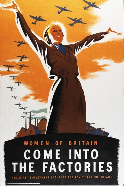
http://vintageposterblog.com/wp-content/uploads/2011/07/ww2-women-factories.jpg 
This is my second example of a propaganda poster from WWII. The overall design is fairly simple and I think that the message that is being put across has been done in an effective way. After reading the text and then looking at the image, to me it looked like the woman was directing the planes which are representing the women. They look as those they are being guided to the factories. Underneath the image there is some text, which is fairly bold and stands out pretty well. This is due to the fact the text is in capitals and that it has been placed on top of a black background, which helps to make it stand out. I found the text at the very bottom quite hard to read as it is a little small, but I think the bit of text that really matters is a good size and stands out really well. The colour scheme is quite plain and mainly consists of yellow and orange colours, but I think that it works well because they don't instantly draw your attention which means you focus on things like the planes, the woman and the text before you look at the other things on the poster.


Examples of World War One Propaganda Posters
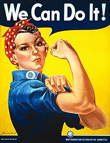
http://upload.wikimedia.org/wikipedia/commons/thumb/1/12/We_Can_Do_It!.jpg/220px-We_Can_Do_It!.jpg 
This is my first example of a propaganda poster from World War I. The overall design of this poster is relatively simple and to the point. There isn't a lot going on in the poster, as the image takes up most of the space but I think the image on it owns make enough of statement that people will understand the message that is being put across. The message that is being put across is the fact that women are strong and they 'can do it', the point of the poster is to try and encourage women to play there part in the war. The colour scheme of this poster is bright and eye catching and definitely draws your attention to it. I think the yellow background helps to lift the image and the text off the page and also helps to everything stand out. The font face is fairly plain but it is clear and stands out well, the white against the dark blue background makes the text look bolder and helps to draw your eye to it.
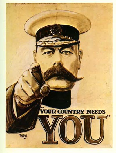
http://farm5.static.flickr.com/4054/4299088242_ab6ddee190_o.jpg
This is my second example of a propaganda poster from World War I. Like with the previous poster the overall design is simple and to the point. Again there isn't a lot going on in the poster, but the message that is being put across is clear and people looking at it would understand what it means. The message on the poster is the fact your country needs 'YOU' (the people) looking at it to help fight and play your part in the war. Having the man pointing at you shows that it is specifically aimed at you and not somebody else. The colour scheme is bland to emphasise the war and the seriousness of it. The font face is fairly plain and easy to read, the word 'YOU' has been made bold and looks like it is in a different font this is to make the word stand out and to emphasise it.

Wednesday, 26 October 2011

Research: Propaganda


“Propaganda is a form of communication that is aimed at influencing the attitude of a community toward some cause or position so as to benefit oneself or one's group.
As opposed to impartially providing information, propaganda, in its most basic sense, presents information primarily to influence an audience. Propaganda is often biased, with facts selectively presented (thus possibly lying by omission) to encourage a particular synthesis, or uses loaded messages to produce an emotional rather than rational response to the information presented. The desired result is a change of the attitude toward the subject in the target audience to further a political, or other type of agenda. Propaganda can be used as a form of political warfare.”

http://en.wikipedia.org/wiki/Propaganda 

Example Propaganda Posters


This propaganda poster has been made to urge immigrants to move to California in 1876. The image of the horn with the fruit coming out of it, is used to represent the phrase 'The Cornucopia of the World' which is on the poster. The cornucopia or as it is also known as the horn of plenty is a symbol of abundance and nourishment. This is generally represented as a large horn shaped container overflowing with flowers, nuts, or wealth, this idea has been used in this poster. Having the "Cornucopia of the World" in the poster should in theory appeal immigrants and make them want to move to California. 

This propaganda poster has been made for the Thirteenth Naval District, which is the United States Navy. The rat in the poster is representing Japan and the mouse trap is representing the Army Navy Civilian and it is on a background map of the Alaska Territory. The date of this poster is between 1941 and 1943.

Tuesday, 25 October 2011

Project Two: Web 2.0 Propaganda Posters

Brief
"You will produce at least one poster promoting as aspect of Web 2.0 Social Media which can be printed at up to A1 size. You should choose social media from the following list or discuss an alternative with your tutors:
  • Facebook
  • Twitter
  • Flickr
  • Google+
  • LinkedIn
  • Blogger
  • Vimeo
  • YouTube
The design must be based on propaganda posters from a period of the twentieth century. You will research, collect and analyse examples of propaganda posters then generate ideas which match these to social media services, creating a suitable slogan which links the design to the service being promoted.
 
You will generate ideas for this project based on research and design development techniques (such as brainstorms, mood boards, sketches) and you will prepare a pitch which puts forward your proposed design solution with a review of how you reached those decisions. You need to explore type choices, colour palettes, poster designs and layouts in this pitch. Illustrator work in progress can be shown as part of this.
 
Your colour palette, graphic style and type choices must reflect the style and content of posters from your chosen period. The graphics will be entirely vector and you will create the artwork in Illustrator at A1 size.
  
You will keep a blog of research materials and project development, including research into propaganda posters, placing these into their historical context and analysing their design characteristics, design decisions, problem solving, software techniques, comments on drafts and crit, with notes on changes and improvements made in response to feedback.
 
You will also develop a sketchbook of visual research and analyses, sketches and idea development, experimentation in things like colour schemes, typography, drawing style, and proofing."
 
This is the brief for the second project, it is to produce a web 2.0 propaganda poster. To create the posters I will be using Illustrator, which is a new piece of software to me and I am looking forward to learning different techniques and to see what I can do in it compared to when I use Photoshop. Alongside coming up with a poster I need to make blog, this will show all my research into propaganda posters, my ideas for colour, typography and diffetent style layouts, it will also show my progression in the project and an evaluation. As well as that I need to produce a pitch, which will give an over view of the research I have done and my ideas that I have come up with. I plan to show clearly my ideas which will hopefully show my understanding into creating a propaganda poster that fits in with the requirements of the brief. Finally I will also have a sketch book, this is where I will be able to draw any ideas that I have, which will help me visually see what I want to do and it will help for developing it further, I will also come up with brainstorms.
The deadline for this project is Monday 28th November, which is a little longer than the previous project. I will definitely take what I learnt from the last project and use it for this one, I will make sure that I keep up to date on the work and not leave it all to the last minute and then rush through it.

Wednesday, 19 October 2011

Evaluation


I think overall the project went pretty successfully. I am quite pleased with the outcome of my panoramas and feel that I have learnt a lot of new techniques, which will help later on.
I found the tutorials at the beginning of the project really helpful and gave me confidence to edit my own pictures. I learnt new techniques that would be good for things that I could do in the future in Photoshop. I also learnt a lot from going out and about taking my pictures. I wasn’t really familiar with using a tripod to help with taking photographs, so it came as a bit of a learning curve, as I needed to make sure the spirit level was in the middle in order to keep all the pictures level to help when it came to stitching. I think that I could improve by thinking more about the type of location that I’m going to use, by taking into consideration the surroundings, as I don’t think I really spent much time thinking about all the lines that I would be faced with, the different levels and the uneven ground.
I don’t think my time management was particularly great. I neglected keeping up to date with my blog, I focused more on the practical side of things and would have been better if I did a post like every day, to help me see the progress I am making. What would have been better is if I had made a schedule so that I’d give myself enough time to take all the pictures that I needed, made sure I spent time up dating my blog and then the rest of the time editing all my images.
The main things that I need to work is my time management and my organizational skills. For the next project I will make sure that I keep up to date with my blog, which will help me when it comes to the organization of my work. I will also spend more time thinking about my idea, rather than rushing through it.

Panorama 3

This is my third panoramic picture.
These are the first six pictures of my final panorama that I stitched together. Although I made sure that I had quite a bit of overlap on each picture, I found it really hard to match the colour of the sky and grass. I didn't need to use the warp that much compared to the use in the previous panoramas, however the layer mask tool and the levels tool came in useful and really helped in blending the images together. 
The image on the left is what the images look like stitched together. I feel pretty pleased with the result and I think that I managed to make it so that it looks seamless. With the help of the layer masks and levels I have been able to match the colours up successfully.

These are the next six pictures that I stitched together. I found these photos the hardest to stitch together because of the lighting in the last three images, I had to do a lot of layer masking and levels to try and get the colours the same. Another thing that helped me to overcome the problem was adding extra layers, I had to open one of my pictures which had the bush it in, selected it and then copy and paste it on to a new layer, to finish it off I used the layer mask tool to help blend the images together.
The image on the left is what the images look like stitched together. I'm not overly happy with the way it turned out, I really struggled with the different lighting and it shows in the results. I think that I managed to line everything up well and in that sense make it look seamless, however the lighting part of the image let me down. 

These are the next six images that I stitched together. I found these a little easier to put together compared to the previous six. I didn't need to use the warp a great deal and there was enough overlap to make it reasonably easy to put together, to make it look more like one image I used the layer mask tool and then the levels tool which helped in creating the same colours.
The image on the left shows what the pictures above look like stitched together. I feel that I could have perhaps used the levels tool better in the sense of making it more seamless rather than being able to see some of the lines down the middle.

The images above are the final ones I stitched together. By having quite a bit of overlap, it made it easier for when I came to join them together. I didn't really need to use the levels tool due to the fact the colours where the same in each picture, I needed to use layer masks to help with the blending.
The image on the left shows the final batch of images stitched together. I think I have managed to make it look seamless and I am pleased with the blending that I did to help me achieve the results. 

Panorama 2

This is my second panorama.

These are my first six images of second panorama that I stitched together. I think that it helped with the fact when I took the pictures I tried to make sure that there was enough overlap to ensure that when it came to stitching them that it would be a little easier. I found the first part couple of images particularly tricky, the rope bridge and the building behind caused quite a problem as I had trouble with lining them up and blending them. To overcome the problem I need to open the first image in a new Photoshop document and then cut out the bridge and then the building behind, I then copied and pasted them into two separate layers and then went on to use the warp tool so that each part was lined up correctly, the next thing that I used was the layer mask tool this was to blend the two new layers with the rest of the picture. The next thing that was a bit of problem was lining up the fence. In each picture the fence was at different levels, which meant when it came to lining them up the fence became wonky and not straight. I used the warp tool to help me line it but by doing that some of the grass became a little distorted, to address the problem I used the layer mask tool and then the levels and that helped to blend the two pictures and matched the colours up as well. 
The image on the left is the first batch of images stitched together. I think that I managed to seamlessly put the images together and I am pleased with how it turned out. 


These are the next six images that I stitched together. There is quite a lot of overlap in each which made it easier for when it came to putting them together in Photoshop. I needed to do a lot of warping to line up the fences and the swing, which created quite a bit of blurring, to sort this problem I needed to use a layer mask to help me blend the images and then use the levels tool to match the colour of the grass and sky because the lighting is different in each picture.
The image on the left is what the images looked like stitched together. I think that I have managed to line up the fence well and also the swing, however down the middle I think that I could have blended the colours better as I can see the line where there are two different colours. What I would need to do is use the levels tool to help me match the colours up. Overall I think the rest of it was pretty successful.


Above are the next lot of images that I stitched together. I found these pictures particularly tricky to put together due to lunes on the fence and the different shades of green of the grass. I needed to do a lot of warping in order to line everything up and make sure it was all positioned correctly, the gate added to the difficulty as it was located in a different place on each picture. The angles in which I had taken the pictures made hard as well, I think that perhaps I could have made it more level which would have made a little easier for when it came to the editing stage.
The image on the left is what the images above looks like stitched together. I'm not sure whether it is as successful as some of the sections of the panorama, however I think that I have done my best in lining the pictures and its looks pretty seamless as well. For next time I will remember to make sure that the images need to be lined up which will then make it easier for the editing stage of stitching them together.  


Above are the next batch of images that I stitched together, I tried to get quite a lot overlap to make it a little easier. The bit that I found the most challenging was the corner part of the fence where the bin is, it was quite tricky lining it up but with the help of the warp tool and the layer mask I think that I was able to blend it rather well. The next challenge that I came across was the swing. I found it hard to line that up as well as the buildings, fence and trees that were behind it, I needed to use layer masks quite a lot to help me get it right with the blending and the warp tool to line and position everything.
The image on the left shows the images above stitched together. I think that I could have lined the fence better as it is a little wonky however I think I managed to blend the swing and the buildings behind it well. 


Above are the last lot of images that I stitched together, I found these pictures reasonably easy to stitch together because of the overlap and the fact I didn't need to do that much warping and only a little bit of layer masking. 
The image on the left is the final part of my panorama, I am pleased with the outcome and I think that I have managed to seamlessly stitch them together.


Tuesday, 18 October 2011

Panorama One


This is my first panoramic picture.


These are my first four images that I stitched together, I found this part quite tricky due to the trees and the shadows on the ground. To blend them together I overlapped the four images and then used layer masks to get blend the images together, I also needed to use the warp on the buildings in the background and on the path which runs through the par, this was to help me line everything to look as those it was one. Apart from blending the trees, I found the sky also quite difficult to blend as it was a different colour nearly on each photograph.                                                
The image on the left shows the first four images blended together. I think that I have managed to successfully put the images together in a way that makes it look seamless. 


These are the next four images that I stitched together, this particular section I found hard because of the fence at the front of the pictures. To blend them together I had to do a lot of warping to line the fence, I then faced a problem of matching the cars together and then trying to match the tree up. I found the layer mask tool useful as the fence came out a different colour in each picture, so I had to use the tool to help blend them, I then finished it off my changing the levels to get the colours right.  
 The image on the left shows the the next four pictures that I have blended together. I'm not sure whether this part was as successful as the first four, but I've done my best to try and get the fence to match up and for the images to look seamless.


These are the next lot of images that I stitched together. I found blending the bins together quite difficult as they were in different positions in the two pictures, I had to do a lot of warping and needed to use the layer mask tool to help with the blending. Another challenging part I came across was the patio part, it was hard enough with the lines on the ground but because of the shadow and the lighting it made more difficult to match and blend them together. 
The image on the left shows the images that are above stitched together. I think that I have been pretty successful in the blending of the images, however I feel that I could perhaps have used the layer masks and level tools better in order to make the sky all one colour.


These are the final two images that I stitched together. With the help of the layer mask and levels tool, I think that I managed to blend them well and making it look seamless. 
The image on the left shows the last two stitched together and I'm pleased with the outcome. I think it helped that there was quite a big overlap, which meant that it was a little easier to blend them together.